Pratum Companies
BRAND IDENTITY
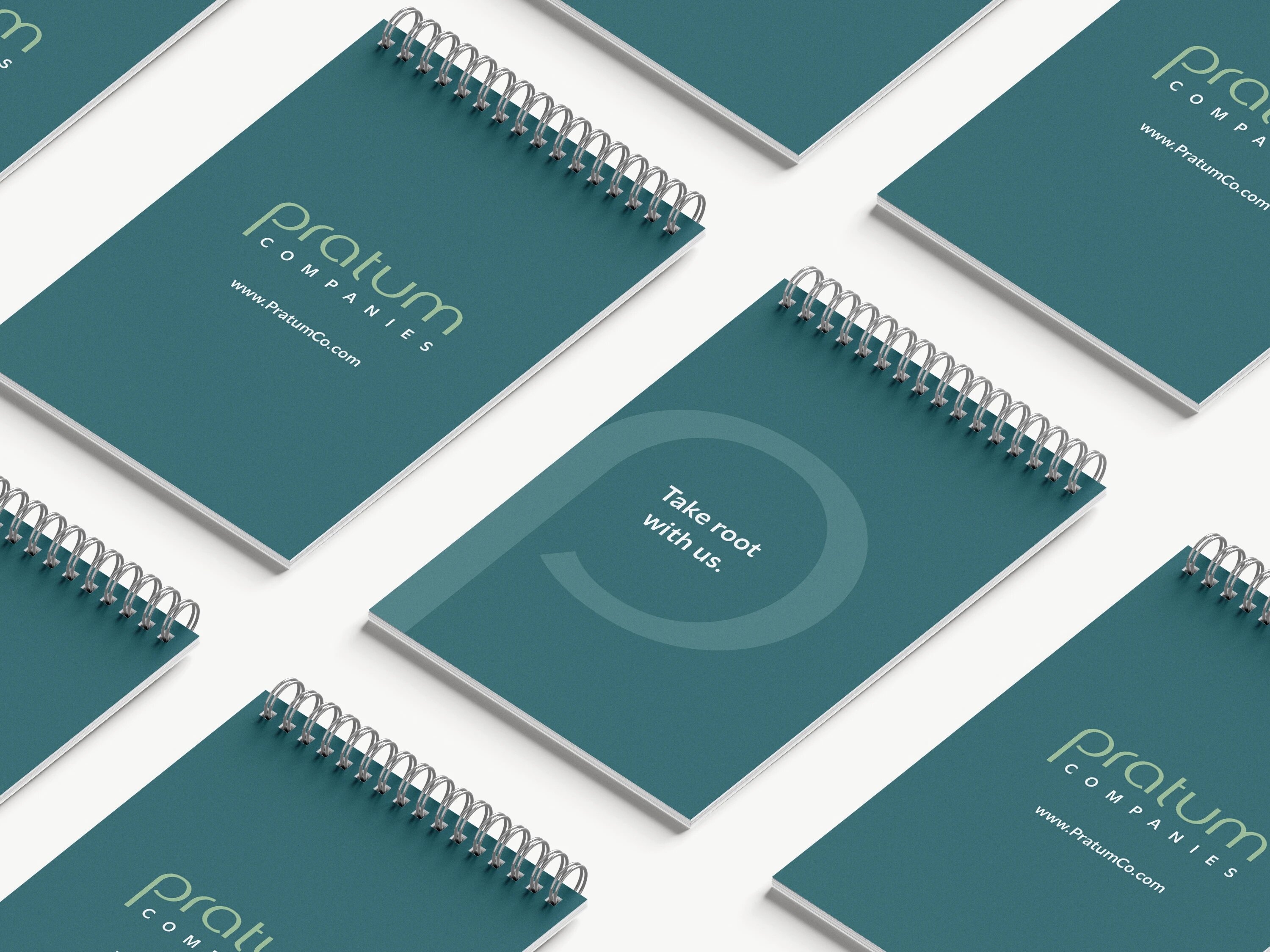
Pratum Companies emerged from the merger of three established real estate brands. GTMA partnered with the team to lead a full-stack rebrand — Naming, Brand Identity, and Collateral Design — that gives their unified vision a name and a voice.
SERVICES PERFORMED FOR THIS CLIENT
NAMING.
VERBAL IDENTITY.
VISUAL IDENTITY.
LOGO DESIGN.
BRAND GUIDEBOOK.
COLLATERAL DESIGN.
BRAND GUIDEBOOK
We developed a comprehensive Brand Guidebook to anchor Pratum’s new visual and verbal identity. From color hierarchy and typography to texture and photography direction, every element reinforces the brand’s promise: take root with us.
BRAND IDENTITY
The Pratum logo retains modernity and simplicity with a stylized wordmark featuring an iconic growing “P” as a standalone emblem. Inspired by an open field — greenery, fresh air, and sunshine — the system is balanced by clean color blocking and confident, thin lines.
BORN FROM THREE, UNIFIED AS ONE
Pratum Companies emerged from the merger of Edgewood Management, Presidential Service Industries, and FCRE Compliance & Leasing — three established real estate companies coming together as one integrated brand. GTMA partnered with the team in Washington D.C. to develop a name, identity, and verbal voice that speak to a single, unified mission.
COLLATERAL & APPLICATIONS
From letterhead and business cards to apparel, notebooks, lanyards, and social profiles, every Pratum touchpoint was crafted to reinforce the brand. Each application carries the wordmark, the “P” emblem, and the warmth of the brand’s natural color palette — so the Pratum identity feels cohesive and confident across every print and digital surface.
A NEW NAME, A UNIFIED VISION
CLIENT COMMENTS
“
[CLIENT NAME, TITLE]
”
“
[CLIENT NAME, TITLE]
”