

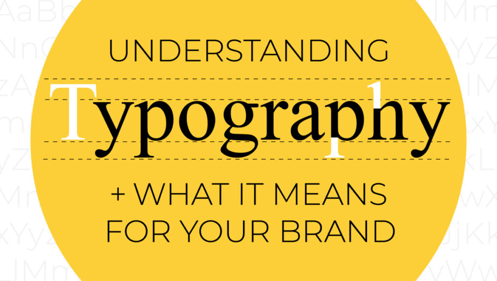
Though often overlooked, typography comprises a very large part of a brand’s identity. Think about all the aspects of your brand that use written content — website, packaging, emails, print collateral, social media content, and internal documents all use written text. The way this text looks can communicate just as much as the writing itself. Understanding typography and creating consistent and well-designed web typography helps sell your brand’s personality and tone and ultimately forges a relationship with your audience.
FONTS AND TYPEFACES TERMINOLOGY
While terminology related to typography and typeface may only seem relevant to UI designers, it is key to understand that there IS careful consideration and work that goes into choosing the perfect typefaces for a brand or design project. There are millions of typefaces in existence, and it’s these little details that differentiate each one; it’s what might make one feel more clean and modern, another feel more classic and traditional, and another feel more creative and playful.
Below are some key definitions to know when it comes to the anatomy of lettering and the arrangement of type. Who doesn’t want to impress their friends and coworkers with uber-specific typography terms — it’s just so cool!
First, let’s define what a typeface actually is.
A typeface is a set of designed characters distinguished by its style and design.
For example, Helvetica is a typeface.
A font is classified within a typeface.
In other words, a typeface family is made up of various fonts. Helvetica is a typeface, but within it are fonts of varying weights and widths. It’s easy to confuse typefaces and fonts — don’t worry, there will not be a quiz at the end. And you can use them interchangeably with your designer, they will know what you mean.
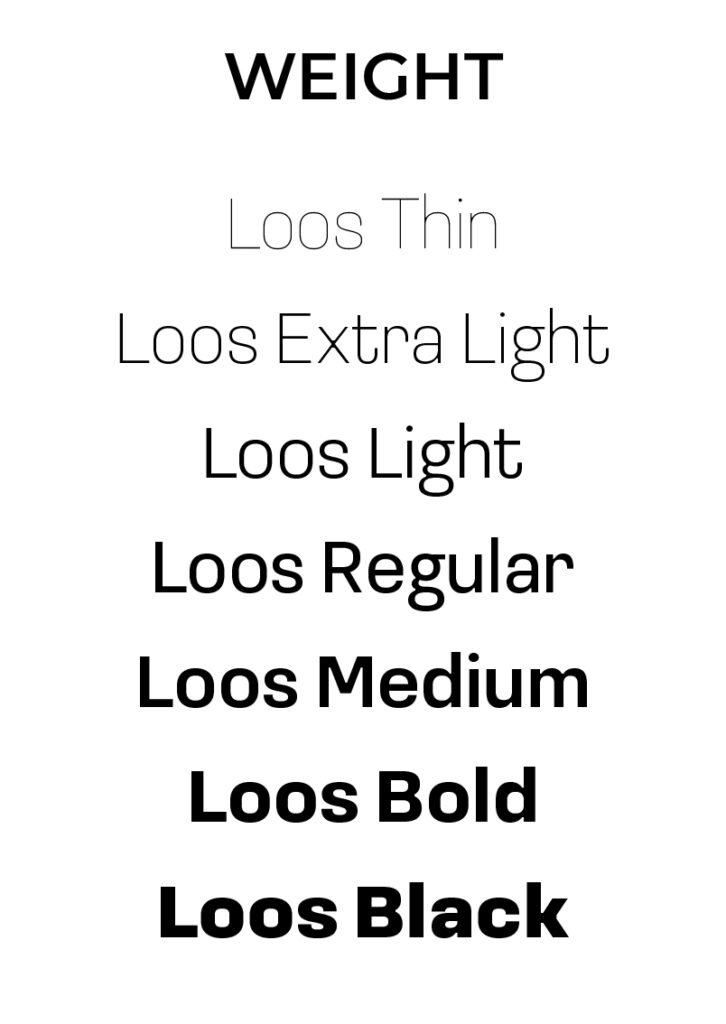
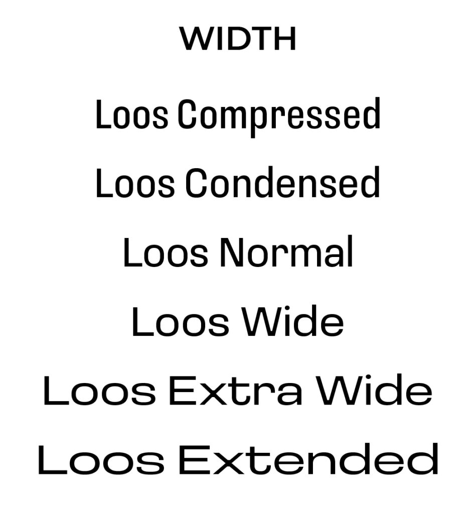
On the subject of weights and widths, these are classifications in a font family.
Weight refers to the thickness or boldness of a typeface’s strokes, and may include thin, light, regular, medium, bold, black, and maybe some in between.

Width refers to the wideness of the characters themselves, and may range from compressed, condensed, regular, wide, and extended.

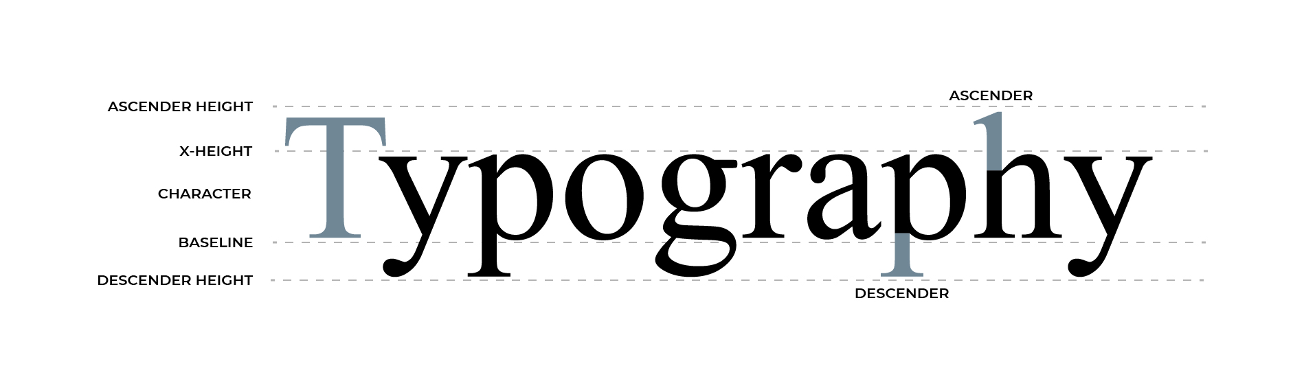
CHARACTER ANATOMY
- Character – a single element such as a letter, numeral, or mark of punctuation. May also be called a glyph.
- X-height – the height of the lowercase x in any given typeface, and therefore the height of the body of lowercase letters in a font, excluding ascenders and descenders.
- Baseline – the imaginary line on which the majority of the characters in a typeface rest. This is where the feet of capital letters sit, and where descenders fall below.
- Ascender – the part of a lowercase letterform that extends above the x-height. In lowercase, b, h, and d have ascenders.
- Descender – the part of the letterform that falls below the baseline. In lowercase, g, p, y, and q have descenders.

TYPE ARRANGEMENT
- Kerning – the adjustment of the space between adjacent letters to optimize the overall visual appeal and readability in a set of text. Kerning varies greatly depending on the letters and typeface in use.
- Tracking – similar to kerning, tracking determines the spacing between letters but adjusts the spacing for entire words, lines, or blocks of text at once.
![]()

- Leading – the vertical space between each line of text.


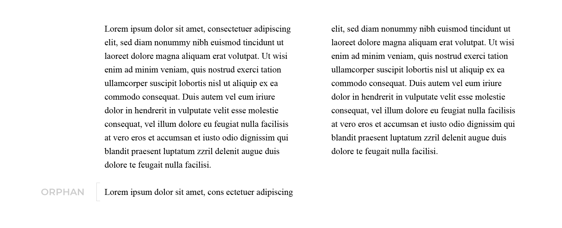
- Orphans – refers to when the first line of a new paragraph is stranded at the bottom of a section. This is considered a bad design practice and should be avoided.

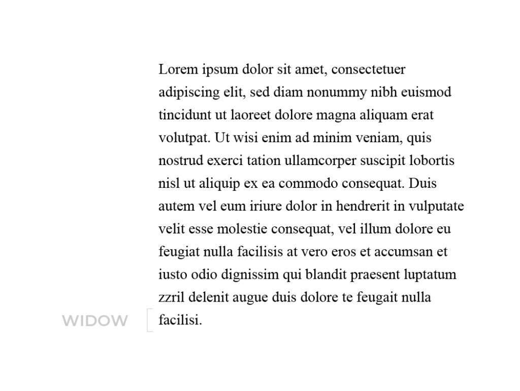
- Widows – when a single word is alone at the end of a paragraph. This is considered a bad design practice and should be avoided.

- Alignment – how text is positioned within margins. It may be right or left-aligned, center aligns (placed at an equal distance from the left and right margins), or justified (flush on both left and right margins).
- Legibility – the ease with which one letterform can be distinguished from the next, or how clear a piece of text is. Legibility is related to but not the same as readability.
- Readability – the ease with which a block of text can be scanned by the eye.
Now, you’ll be able to understand and communicate clearly with your designer, and even apply some of these terms to your own writing! Look at you.
TYPE IS A BRAND’S VOICE AND TONE
Much like color, pattern, and imagery, typography can also create a visual experience. Type design exists in a diverse space where written content can visually represent a brand’s voice and resonate with an audience through both what they are seeing and reading. Your visual message is just as important as your written message, and typography is where both of those intersect.
How do we define that voice and tone? Similar to how we identified key factors in choosing a color palette, we can break down our voice and tone goals into two areas of focus: who our brand is, and who our audience is.
Starting with the desired look and feel of the brand, we can ask questions like:
- What are our goals as a brand? Do we want to inform? Are we selling something? In other words, what is the product or service we are providing?
- What do we value as a brand? Values are the beliefs that you as a company stand for that guide decision-making, actions, and behaviors. Values might include integrity, compassion, quality, confidence, or innovation.
- What is the brand’s personality? If the brand was a human with a voice, how would they speak and act? Are they funny, laid-back, friendly, or serious?
- What does the brand look like visually? Consider aesthetic buzzwords like luxurious, playful, contemporary, rustic, ethereal, or energetic.
Type often takes the backseat next to other visual design elements like logo and color, but the type system must match and complement the rest of your brand’s visual identity.
Then, we can look at who we are sending our message to: the audience with which we are trying to interact with and speak to.
- Who is on the receiving end of the product or service we are providing? What are their gender, age, and location? We can consider these traits of the exact group of people we are talking to. Different demographics will be attracted to or understand particular brand identities differently.
- How should that target audience feel when they interact with our brand? Do we want them to feel informed, safe, inspired, relaxed, or optimistic?
By zooming in on your brand goals, values, personality, and aesthetic, in tandem with understanding your audience and how you want them to feel, we can make more informed decisions when it comes to your brand’s typography. All of these are pieces an audience will resonate with and remember when executed with precision, intention, and style.
TYPE IS STYLE
History and psychology show us that we associate different types of styles with different feelings. Writing can communicate a feeling in a similar way that color can. We can use these innate reactions to type to capture a vocal tone we want our brand to communicate with.
While there are thousands of type styles out there, we can break them down into five categories that describe the basic differences and how they are used to communicate.
FIVE CATEGORIES OF TYPE
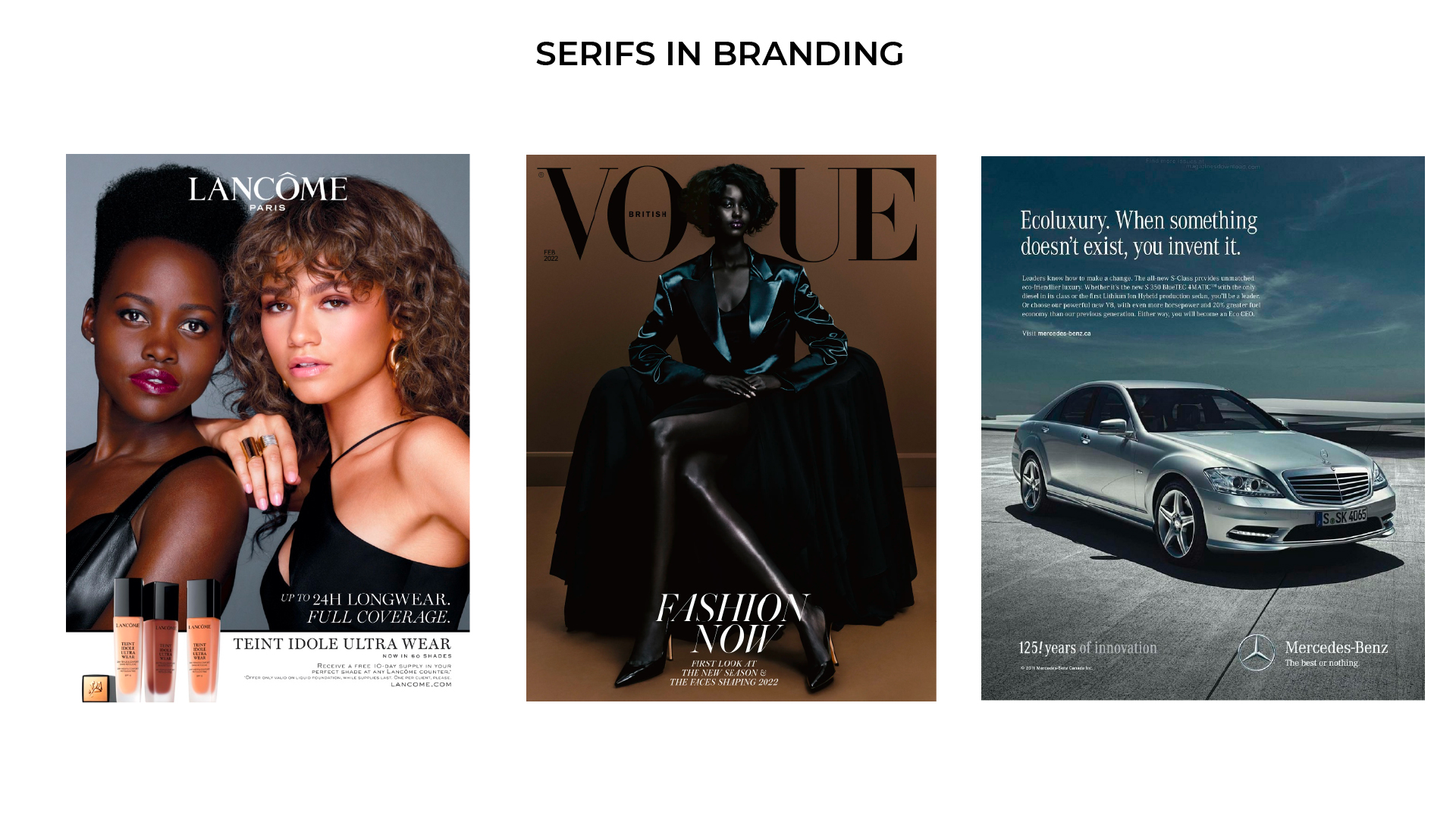
SERIF TYPEFACES
A serif is the flare or terminating flourish at the ends of a letterform’s strokes. We also use this name when referring to the typeface style that contains serif letterforms. Serif typefaces are the oldest typefaces, as they first emerged as early as the 15th century, and were the original typeface of print. Because of this deep-rooted history, serifs are often considered traditional and classic. They communicate feelings of class, formality, and heritage. Their timeless nature carries trust and authority. Serif typefaces are also popular among brands seeking to portray elegance, sophistication, and grandeur. There can be great variation in styles of serif typefaces and they can show a lot of character and personality through their high level of detail.


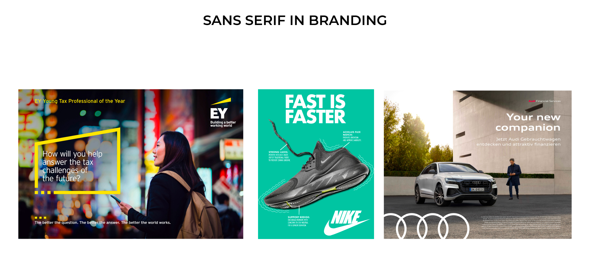
SANS-SERIF TYPEFACES
Sans-serif classifies type families that do not have serifs on their letterforms. Sans-serif typefaces strip away the flourishes and sophistication found in serifs to create something simpler and more modern. Sans-serif rose to popularity in the 20th century, featuring clean lines with consistent thickness, and emphasizing readability and directness over everything. Sans-serif is arguably the most popular type style today, widely used to convey modernity, minimalism, and chic sensibility.


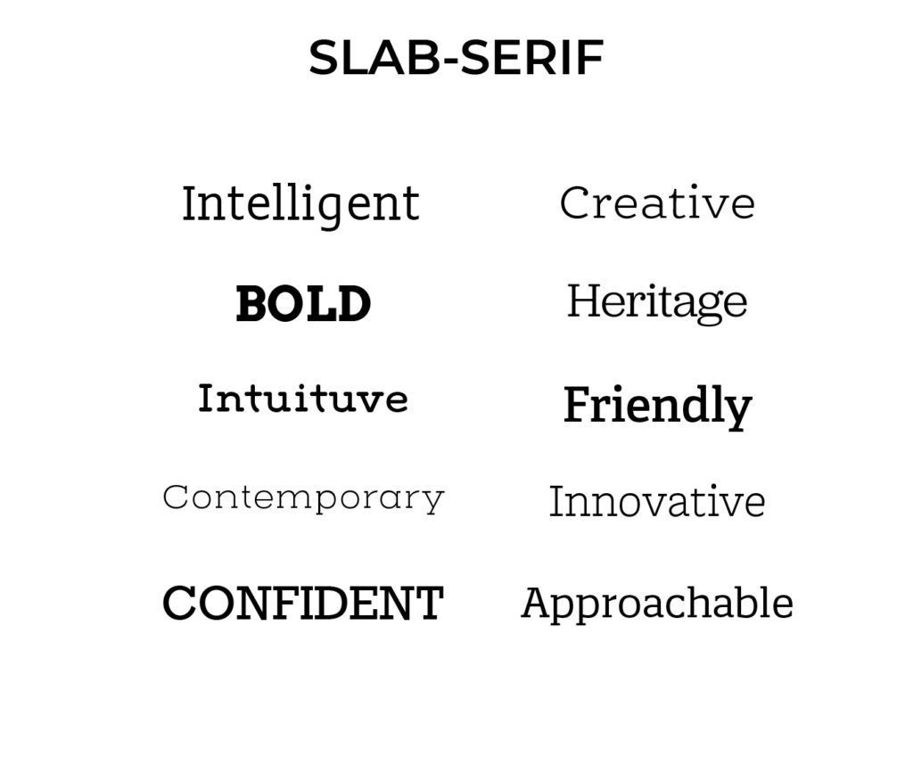
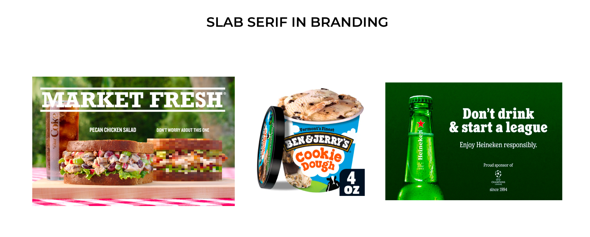
SLAB-SERIF TYPEFACES
Slab-serif classifies type families that have simplified flares at the end of the letterform’s strokes. Derived from serif typefaces, slab-serif typefaces vary in the simplicity of their letterforms – these “modern serifs” are more defined, looking more blocky and slab-like, and use cleaner, more geometric lines, and forms. They follow more closely to sans-serifs in that they are simpler and more solid. Slab serifs offer approachability and dependability, and their similarities to both sans-serif and serif allow them to slot into both modern and traditional contexts.

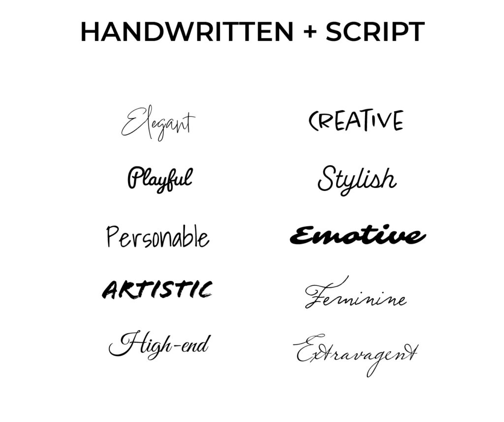
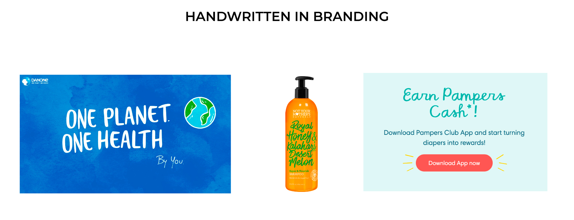
HANDWRITING + SCRIPT
Scripts are typefaces resembling handwriting, often in cursive. There can be a lot of varying styles when it comes to handwriting typefaces. More formal handwritings like scripts use flourishes and curls to evoke elegance, prestige, and femininity, while casual handwriting feels more playful, friendly, and creative. Handwriting can communicate a level of personal touch to brands, and carry great emotion and artful sensibilities. Handwritten fonts are less popular when it comes to branding due to challenges with legibility, though can still show up in logos and accent typography.

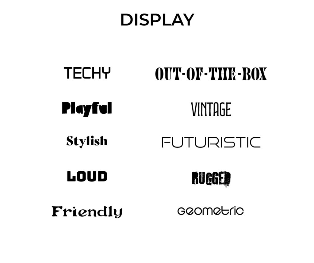
DISPLAY TYPEFACES
Display typefaces are types of font specifically designed to create character and be easily remembered. They can fall into any of the other font style categories but are typically more stylized and decorative in nature. They can come in all shapes, sizes, and styles, but display type shows audiences your brand is distinct and here to show style with a wow factor. They should be used with care and caution as they offer quirkiness, creativity, and off-beat personality that a more standard font might not carry, and can become overbearing when overused. Display fonts should be reserved for logos, accents, and sometimes headings, and should be avoided as body text.

ANATOMY OF A STRONG TYPOGRAPHY SYSTEM
Type hierarchy provides organization in a typography system by establishing the order of importance through visual contrast in the typefaces and fonts being used. Having a clear type hierarchy is key to branding because it not only creates visual interest by drawing a viewer’s eye but also aids in communicating a message clearly and effectively.
There is no cut-and-dry standard for every type system — every brand will look and use typefaces differently. But, there are some good rules of thumb to follow when it comes to establishing a strong type hierarchy within your system.
- Primary font – this is often referred to as the main heading or top-level heading in type blocks. This font should draw the most attention and be able to communicate information quickly. This font should make a statement either through its size, its weight, its styling, or some combination of these.
- Secondary font – this usually falls somewhere between the primary font and the body font. The secondary font, secondary heading, or second-level heading is where structure starts to take shape – it is usually well-differentiated from the primary font, is smaller in size, and accompanies the body text more so than the primary font. As the name suggests, this is the text that should be read second, after the primary heading, and before and body content.
- Tertiary font – the tertiary font is typically reserved for body text. Body text should be as readable as possible as this is where audiences are going to spend the most time reading and absorbing information.
- Accent fonts – while not required, many brands might opt to have a font set aside for special circumstances like decorative type or quotations. This one might have the most character to it, and should be reserved for limited use for maximum impact.
Some other tips and tricks for creating a strong type system
- Keep your system limited to 2 typefaces, 3 at the most if using an accent. You can use fonts with varying weights, capitalization, and tracking values to further add variation while maintaining cohesion. Too many typefaces or too much variety will create a disjointed brand identity audiences might have trouble recognizing.
- Your type system should be applicable across mediums, including desktop, mobile, and print spaces, large and small. Reading something on a billboard is very different from reading a brochure or on a mobile device.
FONT PAIRINGS
Another key to choosing brand typography is finding the right pairing of fonts. Some brands use just one typeface in varying styles (width, weight, capitalization, etc.) to bring contrast and hierarchy. But for those who want to use more than one, it can be challenging to find typefaces that complement each other. You want to find a sweet spot in contrast. Too similar, and your type system does not look intentional or well-structured. Too different, and it will cause brand confusion and a lack of cohesion in tone and voice.
Here are some tips when it comes to pairing specific font styles:
- The most straightforward way to pair fonts is to use a set that exists within the same type family. Most families exist with many variations in width and weight to work with. Some families are even designed with both serif and sans serif options available that can easily pair with each other as they share common stylizations.
- Logos are always a great place to start when it comes to choosing typefaces. Using the font(s) present in the logo is a good way to draw a connecting thread through your visual identity, creating a very cohesive feel.
- Pairing serifs: Serifs work well in all contexts – body text, headings, and logotype. Serifs pair well with sans-serifs, scripts, and display fonts. They don’t pair well with slab serifs because they tend to clash in how similar they appear. Due to their high level of detail, it can be challenging to pair serifs with other serifs, so it is best to stick with one serif font at a time.
- Pairing sans-serifs: Sans-serif typefaces are considered the most versatile because of their simplicity. They work in all kinds of contexts including logotypes, body text, and headings. When in doubt, it’s typically safest to always include at least one sans-serif in your type system. If pairing sans-serif with other sans-serif, it’s best to choose one that is a little more stylized to use as the primary or secondary typeface, and a simple clean one to use for the body, and to make sure the styles still complement and support each other in their forms – striking a balance in width, weight, and geometry is key.
- Pairing slab serifs: Slab serifs are best used in logos and as headings. Slab serifs pair best with sans-serif fonts, as they contain a lot of personality and can clash with other detailed typefaces like serifs.
- Pairing handwritten or script: Because of their high level of personality and fluidity, handwritten and script fonts should be avoided as body text. They can sometimes be effective as headings. Handwritten and script fonts pair best with serifs and sans-serif fonts, as long as it is used as the accent, heading, or logotype. Handwritten and script fonts work best in more limited, deliberate use.
- Pairing display fonts: Display fonts should be reserved for logos, accents, and sometimes headings, and should be avoided as body text. Display fonts, similar to handwritten and script, should be paired with serifs or sans-serifs, and used with more concentrated, statement-making intention.
WEB TYPOGRAPHY: CASE STUDIES
To get a better understanding of developing a brand typography system, we can narrow in on a couple of type systems the Branding + Design specialists at GTMA have developed for clients.
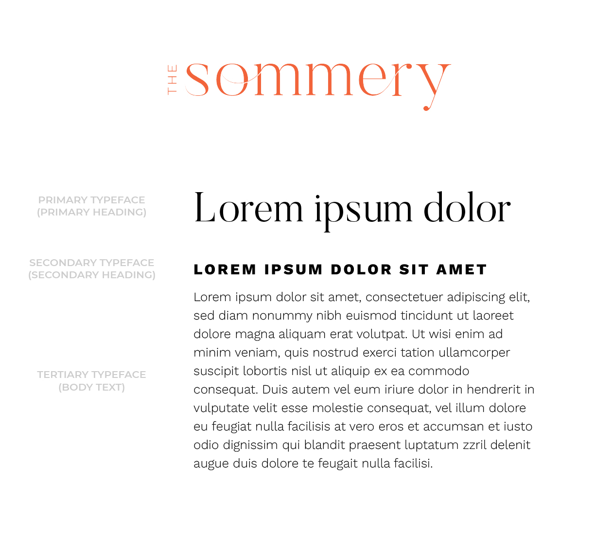
THE SOMMERY
Our first example is The Sommery, an apartment community in Round Rock, Texas. The Sommery’s tone is a combination of modern energy and sophisticated femininity – ‘European’ was a strong keyword for us through the entire branding process. Because we designed their logo as a stylized wordmark, we pulled those typefaces into the type design system, with enough differentiation to help the logo feel distinct yet well connected to the written content. The primary typeface is a light stylish serif we kept in lowercase to feel elegant but not too formal. Our secondary and tertiary font is a friendly sans-serif with softened elements – we used it in all-caps bold with some tracking to give it energy and draw the eye in, and kept it light for body text for legibility and readability. This type system helps carry a tone of graceful modernity with a good level of contrast in font choices.

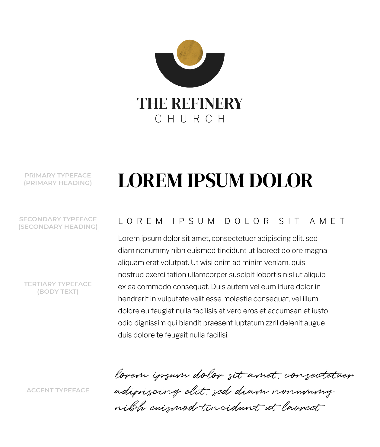
THE REFINERY CHURCH
The next example is a good example of a brand with an accent typeface. The Refinery Church in Temecula, California wanted their brand to feel modern while paying respect to tradition, as well as convey a warm and friendly tone accessible to all. The type system is led by an all-caps, bold serif. The secondary and tertiary typeface is a light, minimal sans serif, used in all-caps with a high level of tracking for the secondary to further the clean, minimal look. Both the Primary and Secondary typefaces are present in the logo design as well. To add some humanity to the brand, we brought in a handwritten script typeface to use as an accent or to highlight specific words and phrases in expressive type blocks.

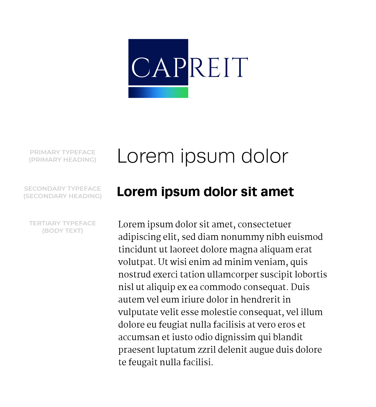
CAPREIT
CAPREIT is a real estate investment brand with a unique case, in that they came to GTMA seeking a rebrand using existing elements rather than building a brand from the ground up. Their desire was to bring the brand up to the 21st century while keeping the logotype the same due to the history and recognition it held. Instead of bringing the traditional serif typeface from the logo design into the system, we selected a modern serif that complemented it, referencing and paying homage to the logo while still feeling contemporary. That typeface found its place as the Tertiary typeface, as we led the new type system with a friendly modern sans-serif in light for the Primary and bold for the Secondary.

SUMMARIZING TIPS
Here are some closing tips to remember when it comes to creating or updating your brand’s typography.
- Be timeless, not trendy. It’s hard to resist the pull to use whatever typefaces are “in” at the moment. It’s a natural and necessary move to modernize your brand, but it’s also important to not choose brand elements based on what’s the most popular or that will date quickly. Typefaces, especially older ones that are easily recognized (looking at you, Papyrus and Comic Sans…), can drive away an audience because one can pinpoint the exact era the typeface came into popularity. Not only that, but using trendy typefaces can cause your brand to get lost among all the other brands in your industry doing the same thing.
- Treat your typography and typeface with care. UX designers undertaking DIY branding will be tempted to just use whatever fonts are built into their computer or design tool. Using default fonts or fonts that come with tools like Canva will cause trouble for brand recognition. It will also create a sloppy and forgettable look, especially if you change your fonts on every marketing piece you send out or don’t stick to hierarchy rules. You want your audience to see and feel you took time to curate a branded experience, and are committed to consistency – it shows your audience that you really care about how they experience your brand and ultimately builds a lasting, trusting relationship.
- When in doubt, aim for simplicity + versatility above all. Typography is, after all, writing that is meant to be read. Your first priority should always be to maintain optimum legibility and readability in all contexts, print or digital, big or small. Some brands feel the urge to use the most unique, interesting typefaces, but there is something to be said about going back to basics. The typeface is not the focal point of the brand – the message is. There are ways to leverage typefaces that are less detailed and not filled with flourishes and pizzazz, so you can say a lot with a little.
CONTACT US