Understanding Color Marketing & What It Means For Your Brand.
Color is used as a communication tool in most aspects of life—it is vital to expression and the human experience. Our wardrobe reflects the colors we want to project. We buy and use products in colors we like. We paint and decorate our homes in colors we find joy and peace in. Colors have become ingrained signals to use. In this way, your brand’s color palette is no different. Color is considered the immediate first interaction and impression we have with a brand. A brand’s color palette appears everywhere: in the logo, the website, email communications, social media, advertising, storefront, stationery, uniforms, and events.
Color has a way of affecting us like nothing else because of its innate nature—we don’t have to learn how to react to different colors. And with that, color has a deep effect on buying products and productivity, as it evokes emotion, inspires reactions, and changes modes of thinking.
There are a lot of nuances that can go into what colors we select to represent our brands. We want people to feel a certain way when they see or interact with our brands. Color marketing is defined as so much deeper than surface level. We respond to hues, tints, shades, as well as how the larger, full palette is telling its own story through how the colors are interacting with each other.
COLOR TERMINOLOGY
It’s fair to assume that only designers are well familiar with the various and vast terms used to define and differentiate colors. We spend ample time toying with (and sometimes agonizing over) what palettes work to capture the essence of a brand. But what are those pieces we are adjusting and testing to achieve the desired effect? Here is a breakdown of some of those concepts used in color marketing:
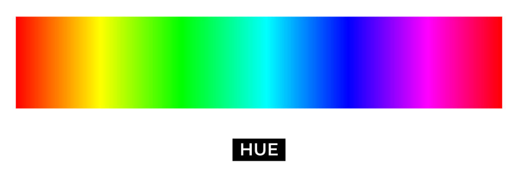
HUE
Hue is the most simple yet significant scale for color. It essentially is a color. It’s what makes red red, blue blue, and yellow yellow.
SATURATION
Saturation marks how much of a color there is. Lower saturation means it is moving closer to gray, while high saturation is a fuller amount of color.

VALUE
This scale defines the lightness or darkness of a color. Thinking of the shade or value scale of red, the farthest ends of the scale would be black and white, with red filling the middle. This may also be referred to as “luminance.”

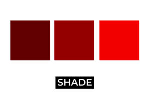
SHADE
How much black is present in the hue. Or, how “dark” a color is. The value scale defines a color’s shade.
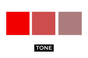
TONE
How much gray is present in the hue. Or, how “bright” or “dull” a color is. The saturation of a color defines its tone.
TINT
How much white is present in the hue. Or, how “light” a color is. The value scale defines a color’s tint.

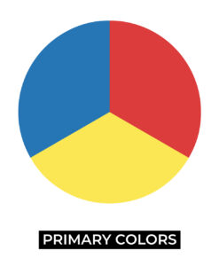
PRIMARY COLORS
Red, yellow, and blue. These are considered the base colors for all color mixing.
SECONDARY COLORS
Orange, green, and purple. These colors are created by mixing each primary color with the one next to it. Think how red mixed with yellow creates orange.

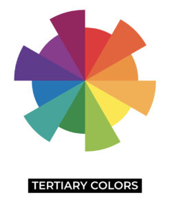
TERTIARY COLORS
Created by mixing a primary color with a secondary color next to it. Think how blue mixed with green creates cyan.
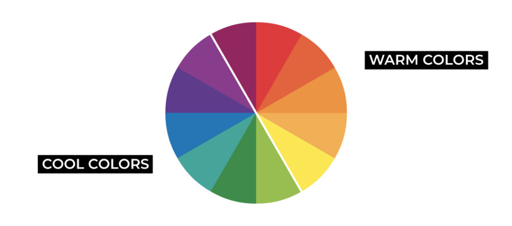
TEMPERATURE
How warm or cool a color is. Reds, yellows, and oranges are considered warm while greens, blues, and purples are considered cool.
COLOR MARKETING DETERMINES A BRAND’S AURA AND ATTITUDE
As mentioned before, color is typically our first visual interaction with a brand. So it is important that we capture as much of the brand’s personality in the color palette as possible. We can break this down into two specific areas of focus that will help define the color palette: the brand, and the audience.
First, looking at the brand itself will narrow in on the kind of look and feel we are going for. We can ask questions like:
- What is the goal of the brand? Do we want to inform? Do we want to sell a product? In other words, what product or service is being provided?
- What are the values of the brand? Values can include family, honesty, service, integrity, safety, or confidence.
- What is the personality of the brand? These could be traits like formal, fun, confident, passionate, friendly, or laid back.
- What is the visual aesthetic of the brand? This can be defined by buzzwords like luxury, timeless, romantic, energetic, relaxed, playful, serious, sophisticated, contemporary, rustic, earthy, or ethereal.
And, we can look at the target audience to better understand who is on the receiving end of our branding, who will be interacting with our brand:
- Who is the target audience? We can consider traits like gender, age, and location. These traits will help define who we are aiming to get the attention of.
- What should the audience feel when they engage with us? These feelings might include optimistic, informed, safe, inspired, or relaxed.
A brand color palette becomes so much more than choosing your favorite colors when we break it down as brand goals and audience goals.
COLOR IS FEELING
Due to millennia of color association with the natural world and simply how our brains react when we come into contact with them, we’ve grown to have innate associations of colors and what they mean. Here are some basic breakdowns of what certain colors can mean or make us feel.
Brand Color Palette Samples
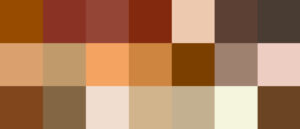
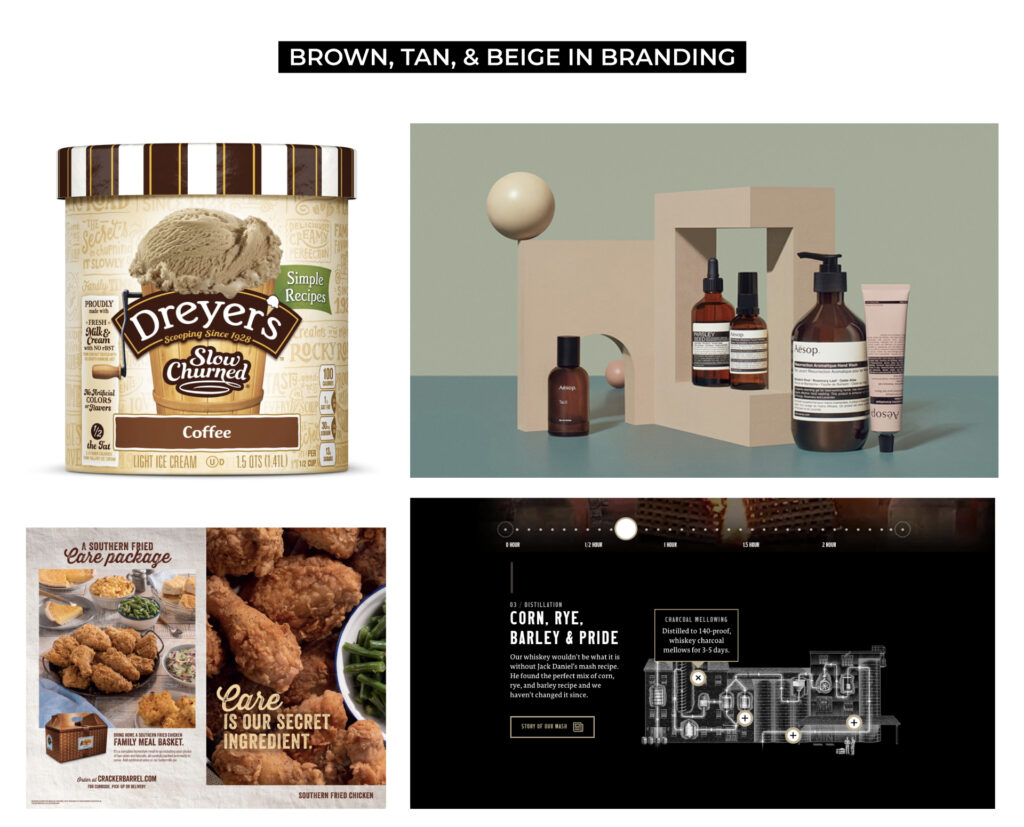
BROWN, TAN, AND BEIGE
Because brown is the color of earth, stability and solid foundation emanate from it. Shades of brown, tans, and beiges relate to the natural world and rusticity. It is used to convey steadiness, reliability, honesty, comfort, and create warmth and wholesomeness.
GRAY
Gray is a color of compromise and practicality. Usually accompanying other colors in a palette, gray’s quiet neutrality and reserved refinement are associated with maturity and timelessness.

WHITE
Purity, innocence, and simplicity are a few of the qualities held in white, although white is mostly considered a neutral that can pair with anything and everything. White is largely a blank canvas, though shifting its tones and hues ever so slightly can create warmth or coolness too.

BLACK
The darkest color technically is the absence of color altogether. Black and its various shades is a color of mystery, power, and elegance. However black is mainly considered a neutral too and used in conjunction with other colors.


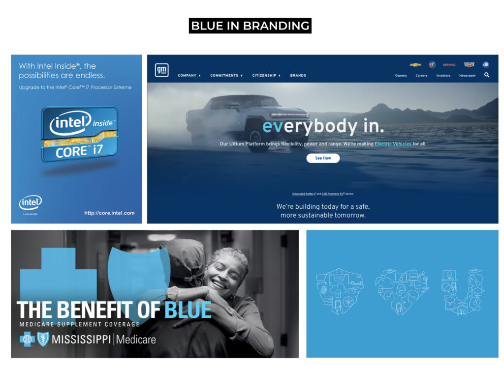
BLUE
Blue is considered the color of trust, loyalty, and intelligence. It’s a popular color, especially in tech, health care, security, and finance because it reduces stress and evokes safety and reliability. Lighter blue tones further bring calmness and tranquility, while darker blue tones like navy convey authority and strength.

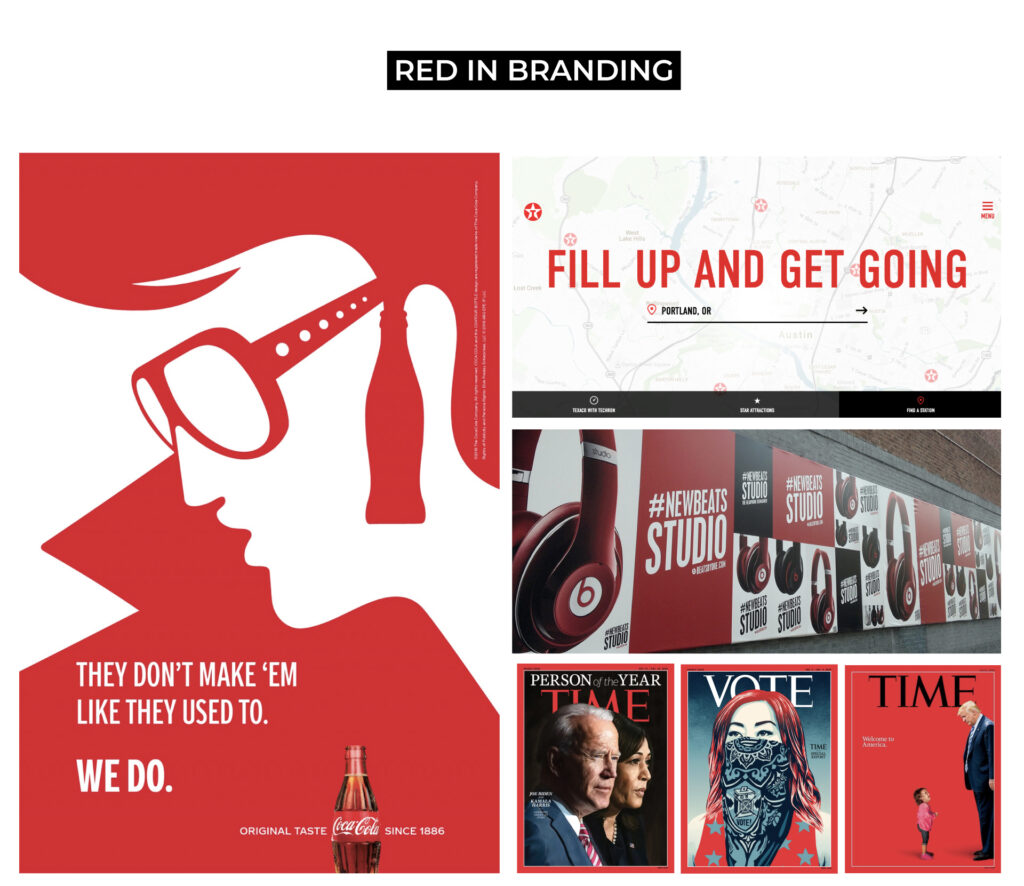
RED
Red is the color of passion and attention. It’s often associated with our strongest emotions like love and anger and it’s universally recognized to signify danger. It is stimulating and summons courage and power. Darker red tones carry the same passion, but through their toned-down muted shades they possess more sophistication and maturity.
YELLOW
Yellow is regarded to be the color of optimism. It conveys youthful and fresh energy. It is uplifting and illuminating. Yellow is known to stimulate the brain and help with clear thinking and quick decision-making. Because of its high visibility yellow is also often used in caution. Gold is another tone of yellow that evokes more prestige and compassion.


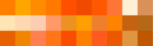
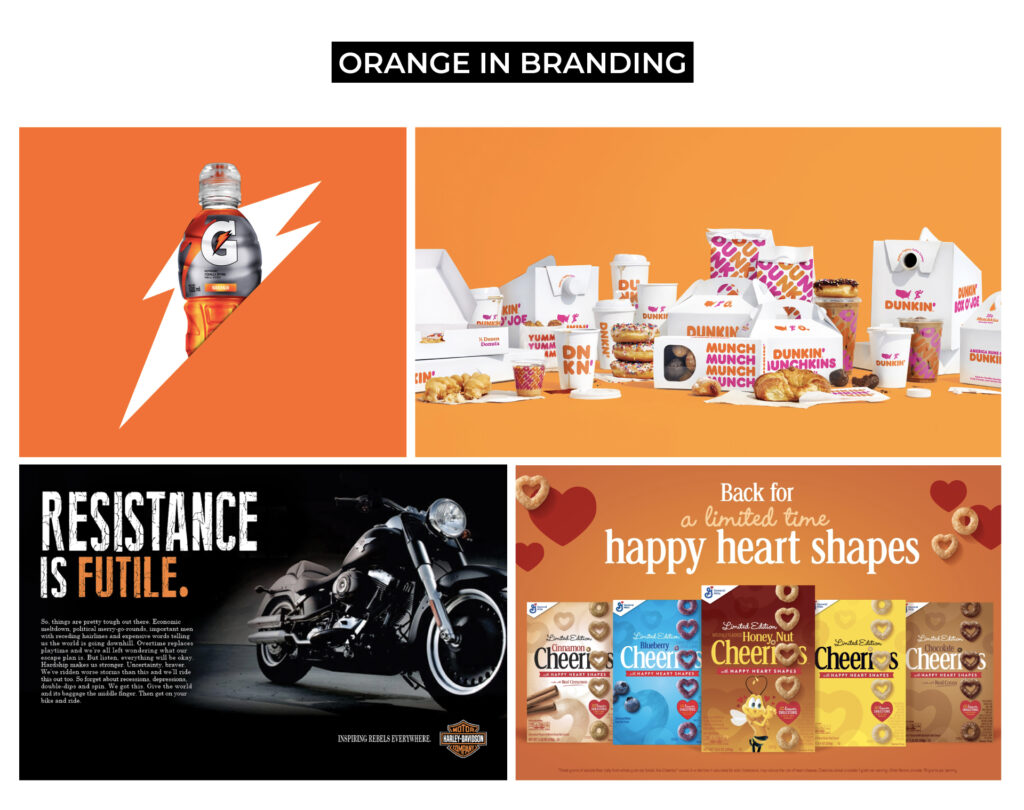
ORANGE
Enthusiasm and youthfulness mark the color orange. It carries both the qualities of red and yellow to create something energetic and encouraging. It signals warmth, positivity, creativity, and spontaneity. Deeper orange errs into more warmth and stability.
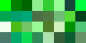
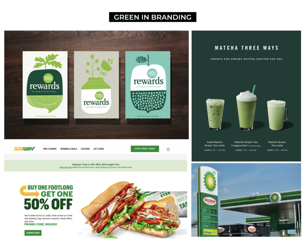
GREEN
Rooted in nature, green is the color of growth and health. It expresses renewal and life with refreshing and peaceful connotations. It’s also linked to success. Bright and light greens are energetic and dynamic while deeper tones evoke prosperity and reassurance.
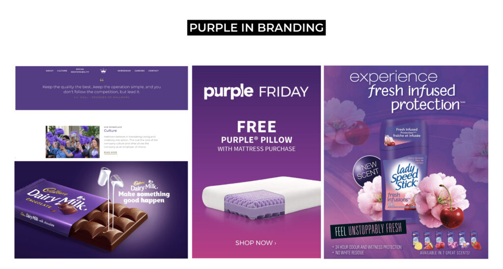
PURPLE
The energy of red and the calmness of blue combine to create purple, a color of reflection, spirituality, and self-awareness. It brings compassion and intuition. It’s also long been associated with royalty with characteristics of quality and luxury. Light purple tones have more soothing, sensitive qualities while darker purples evoke wisdom and introspection.
PINK
Pink combines qualities of purity of white and passion of red – it signals femininity, love, sensitivity, compassion, and playfulness. It’s thought to be the color of romance and kindness. Lighter pinks summon more sensitivity and softness while deeper pinks bring more confidence and fascination. Coral and salmon hues possess qualities of warmth and sociability. It brings forth positivity and fun and is welcoming and distinct with a pleasant supportive personality.


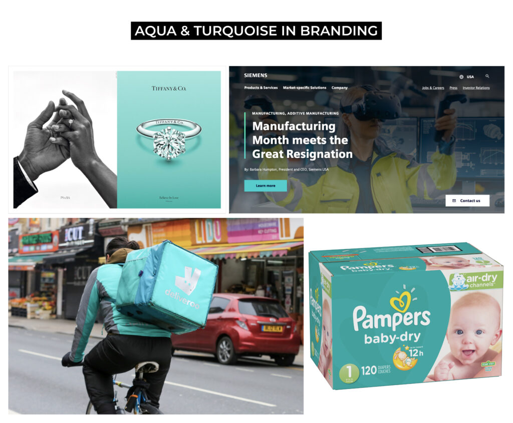
AQUA AND TURQUOISE
Turquoise and aqua tones are considered combinations of blue and green, carrying the same tranquil and refreshing qualities. These hues evoke calmness and clarity, positive mental energy, and balance.

Understanding the psychology behind how we interact with color is a core fundamental step to developing a color palette. Every palette needs a starting point, and choosing that starting point should be rooted in our brand’s goals, aesthetic vision, audience relationship, and color psychology. Next, we will get into the types of color relationships that exist.
TYPES OF COLOR RELATIONSHIPS
Setting a base color is a good first step when it comes to building a harmonious palette that surrounds it. The base color may be the color you KNOW you want to use because of the psychology behind it and how it relates to your brand aesthetic, goals, and audience regarding your color marketing campaign.
A color palette doesn’t have to follow any of the types outlined below, but these are good rules of thumb to carry into developing a palette when it comes to color balance and harmony.
ANALOGOUS
An analogous color relationship consists of colors that line up next to each other on the color wheel. The result is a very harmonious gradient-like grouping of individual colors that blend and relate to each other nicely. The distance between hues can vary from little to great, which will affect the range of color hues in the palette.
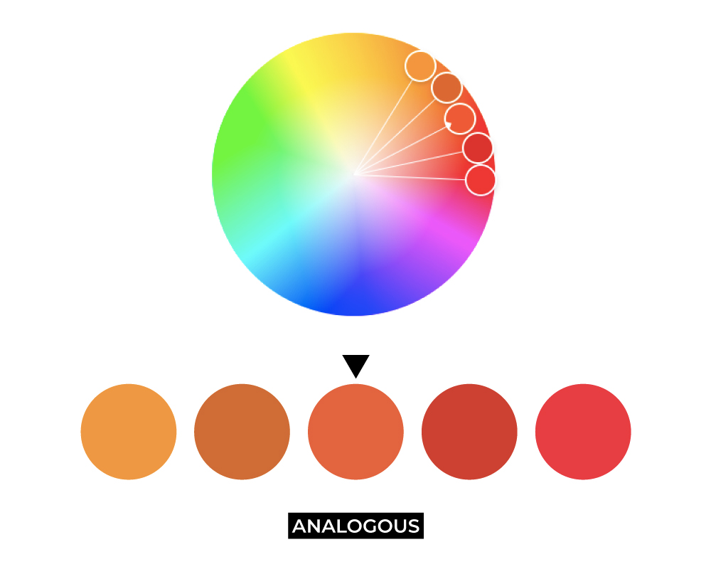
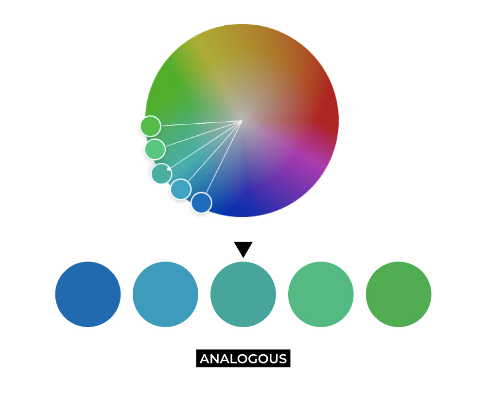
This type of relationship is really pleasing to the eye as it feels like a natural progression and movement of color, like how a sunset is graduated. This type is also used if a brand wants some range while staying on either the warm side or cool side of the temperature scale in their palette.
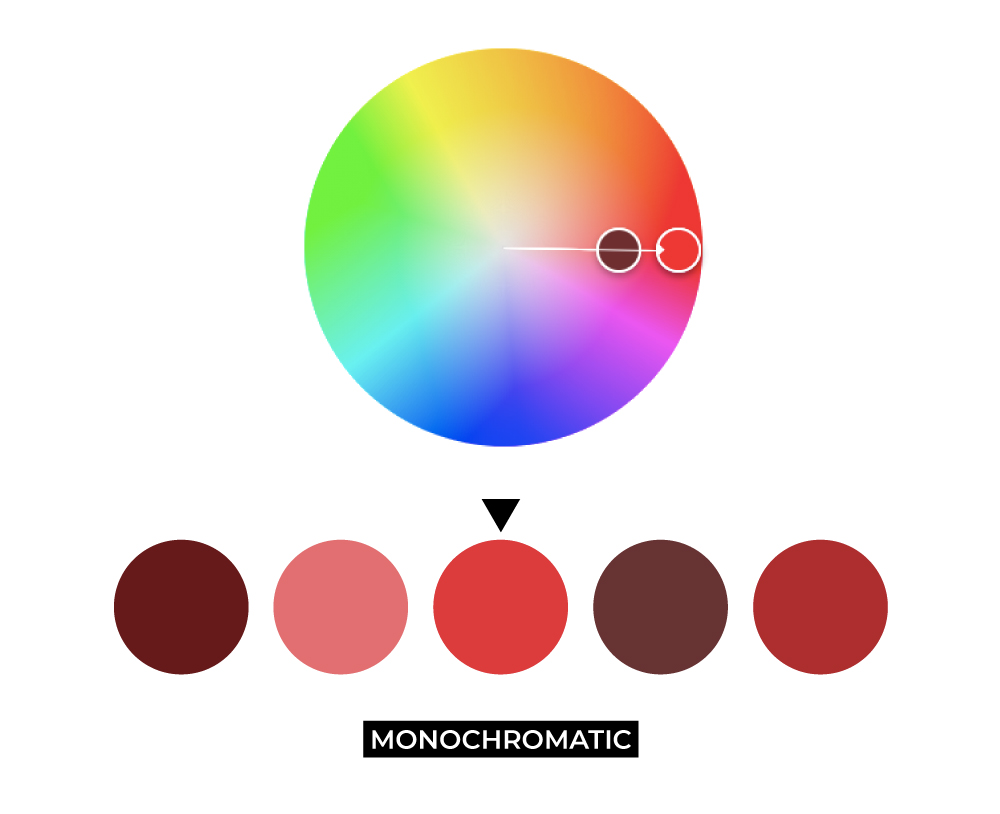
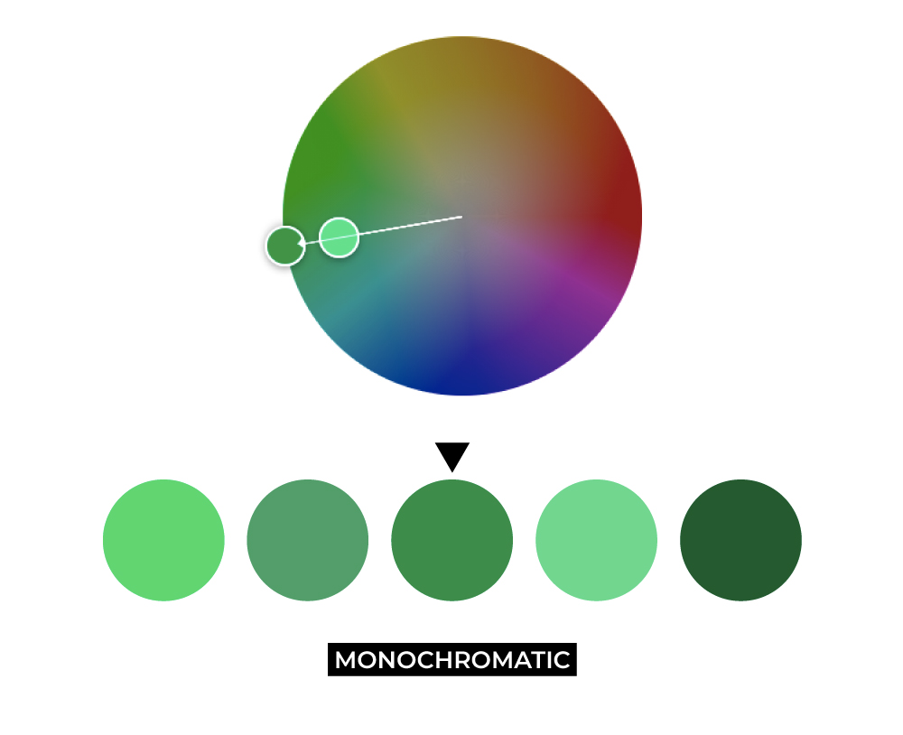
MONOCHROMATIC
Monochromatic relationships use one color hue and varying tints, tones, or shades of that color. Varying the distance between colors can affect how similar or monotone the complete palette is. Monochromatic palettes bring forth uniformity and cohesion.
TRIAD
A triad relationship is broken down by sending spokes into thirds on the color wheel. It helps to think of the color wheel like a pie chart – your base color sits at 0%, and your other colors sit at 33% and 66%.

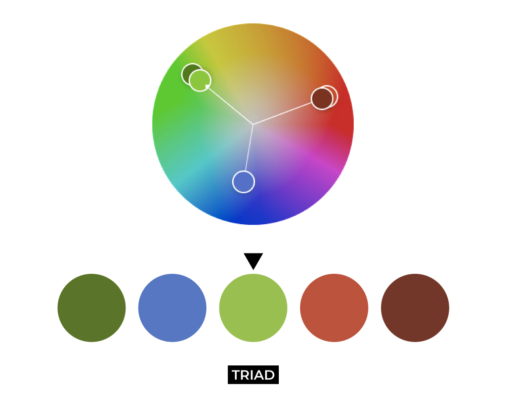
The triad relationship is a medium between complementary and analogous – the hues aren’t quite exactly opposite each other but still occupy the same distance from each other to create a well-balanced palette.
COMPLEMENTARY
A complementary relationship splits its spokes exactly opposite down the color wheel. In other words, if your base color is at 0, your secondary color would be at 50%.
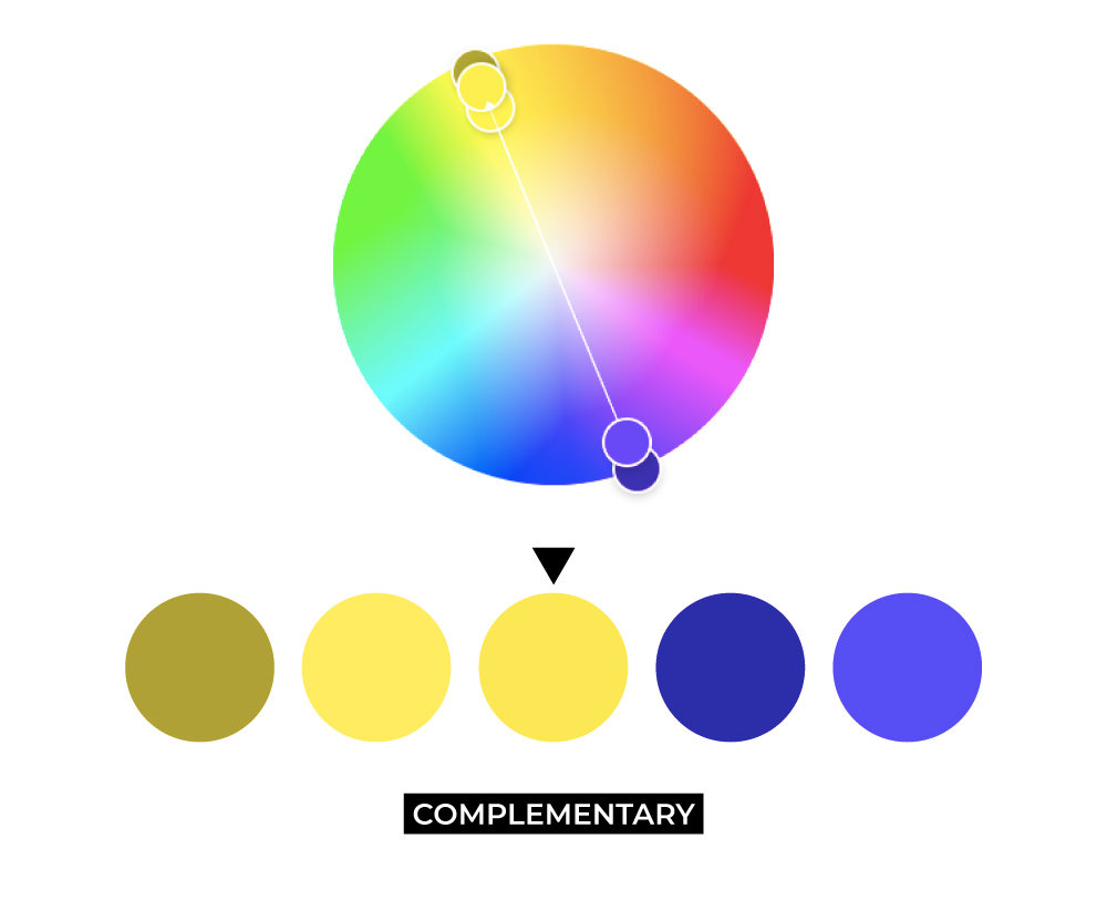

A complementary palette makes for a high-contrast design while only consisting of two main color groups.
SPLIT COMPLEMENTARY
Split complementary carries the same idea and high-contrast qualities of a complementary relationship, but instead of one spoke directly opposite the base spoke, there are two spokes with a small distance between placed opposite the base color. If your base color is at 0%, the other two spokes would be placed around 45% and 55%. Your base color is considered a standalone “pop” while the supporting complementary colors make up the bulk of the palette.
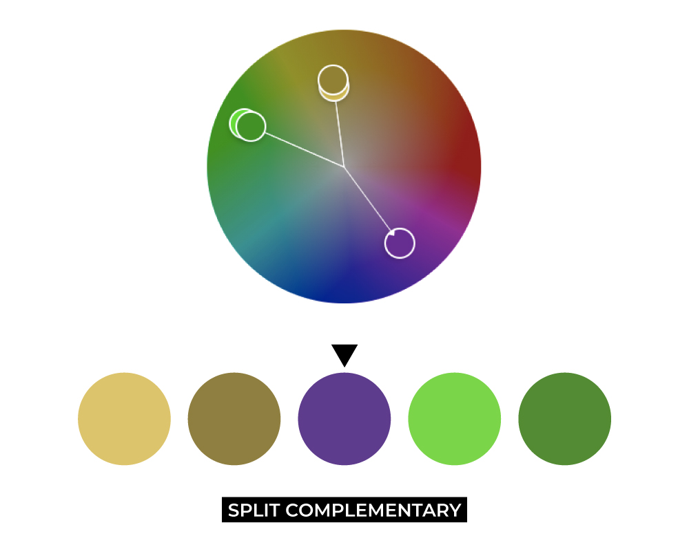
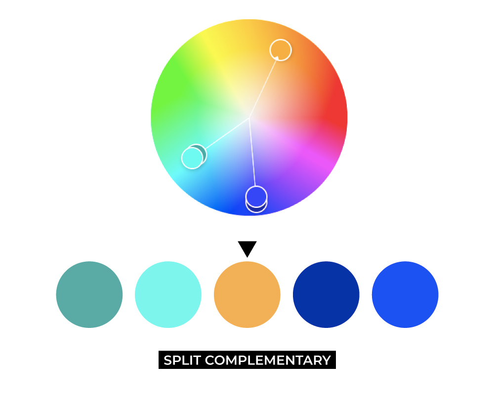
A split complementary relationship offers more variation and range in color than a complementary relationship would, while not forgoing balance and contrast.
DOUBLE SPLIT COMPLEMENTARY
This relationship type combines split complementary and analogous relationship types (getting confused yet? Stay with us…). This palette type includes five spokes on the color wheel again – your base color as one, two spokes being analogous with the base on either side of it, and two spokes as split complementary opposite your base. If your base is at 0%, the two analogous colors are at 5% and 95% and the split complementary colors are at 45% and 55%.
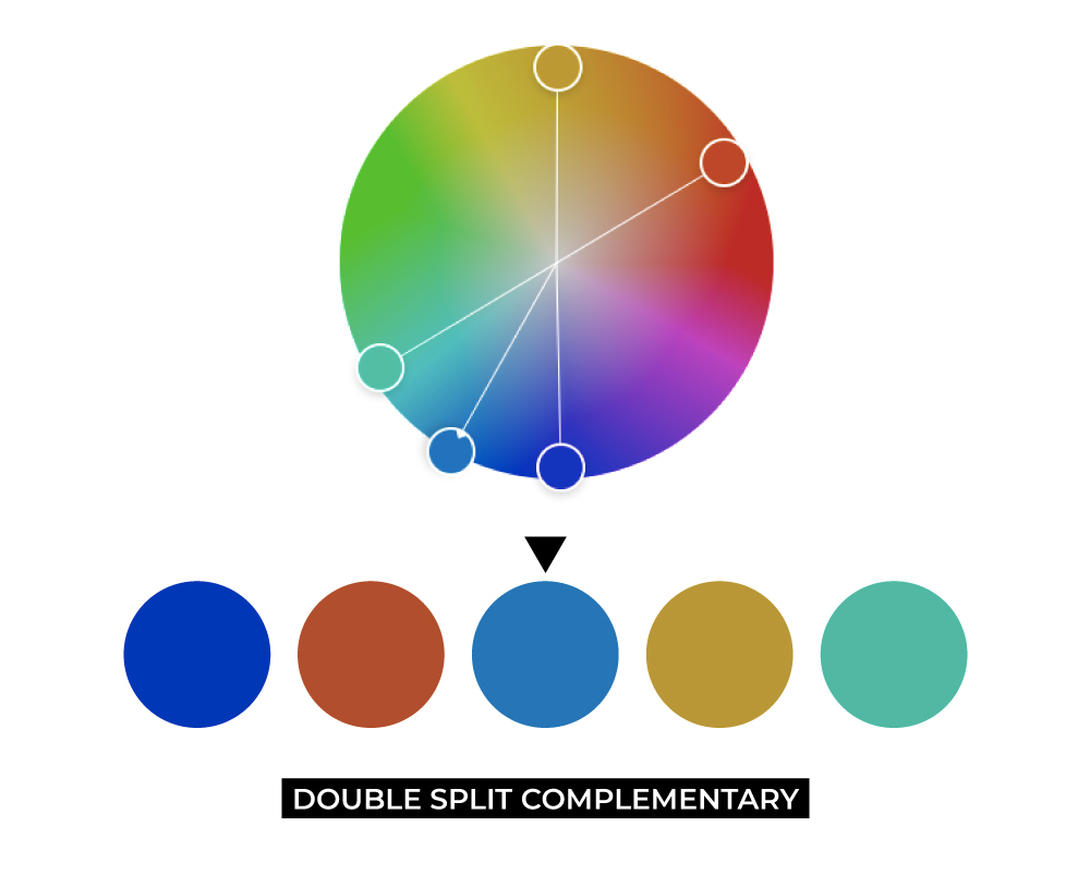
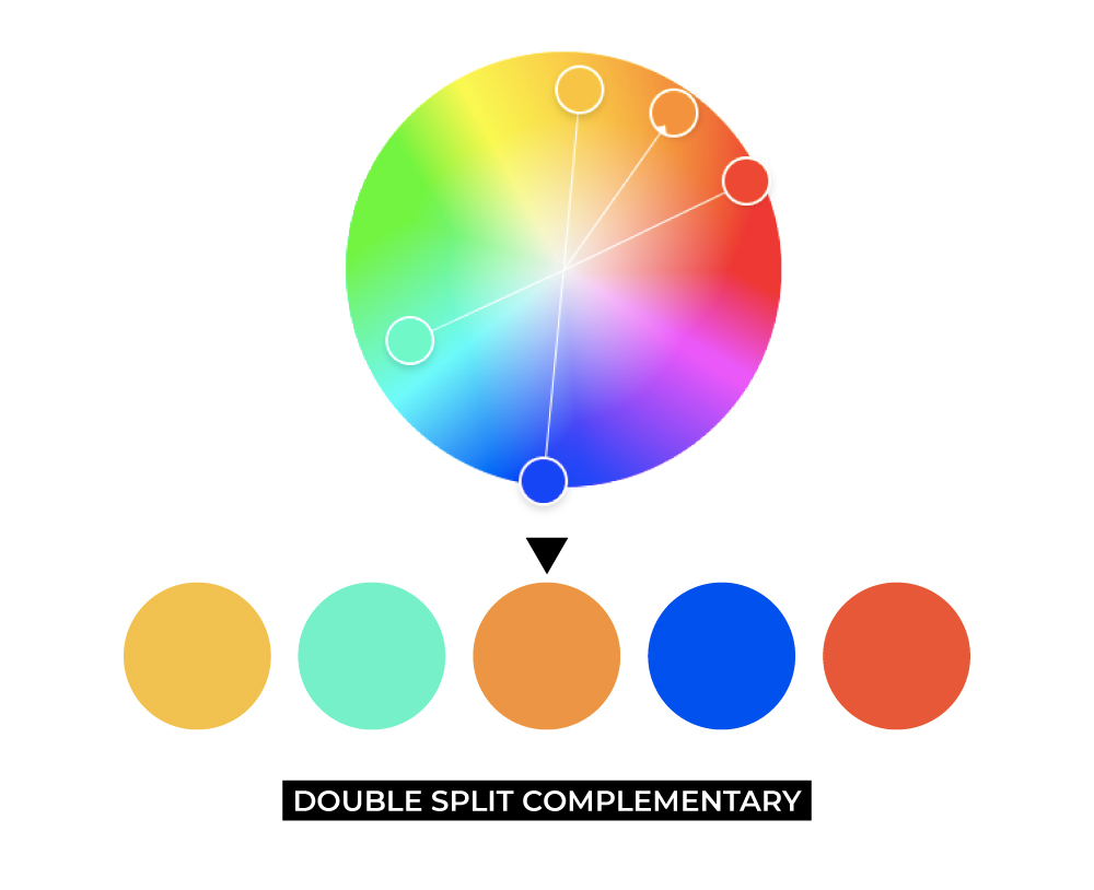
The resulting palette has great variation and range but is still pretty well balanced like complementary or triad relationships.
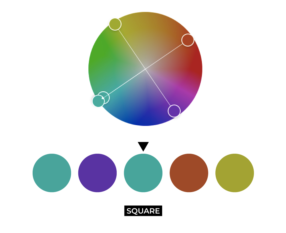
SQUARE
You will see the most color variation and range in a square relationship. This relationship has four spokes each placed equidistant in the color wheel – your base at 0% and the rest at 25%, 50%, and 75%.

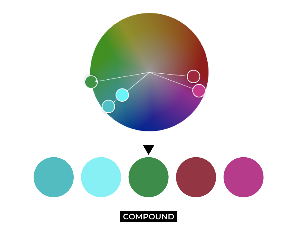
COMPOUND
A compound relationship follows the same principles as a complementary relationship, except instead of using colors that are opposite each other on the wheel, it uses colors on either side of the opposite hue. So in that sense, it is ever so slightly less in contrast and variation while still maintaining very close characteristics to complementary palettes.

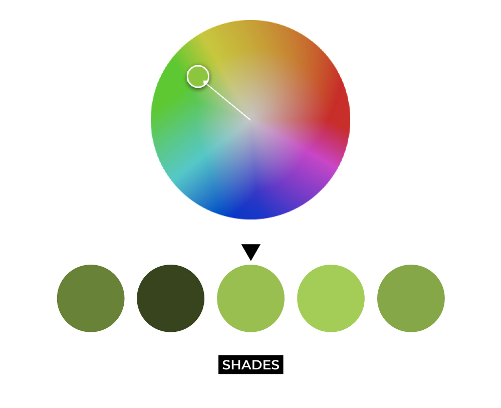
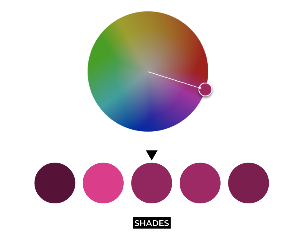
SHADES
Very similar to the monochromatic relationship, this relationship style is simply built with different shades and tints of the same color hue. It technically has less variation than a monochromatic relationship would because the monochromatic relationship allows for adjustments to tone in addition to shade and tint. A shade palette simply exists as a scale of your base color to white and black.
ANATOMY OF A STRONG COLOR PALETTE
With an understanding of color psychology and the types of color relationships we can include in a palette, there are other pieces and factors to consider when building out a full, functional brand color palette. It’s one thing to make a palette out of intriguing or pretty colors, but when it comes to applying your palette to your branding you might run into some difficulty in flexibility. While there is no set formula for the perfect color palette, there are some good structural rules of thumb for developing and using a strong brand palette:
- Main colors.
- Always start with one main color as your base color. This is the color that you want to create the most brand recognition with. It is your “signature” color, so to speak.
- Depending on how big you want your palette to be, there may be a few secondary main colors that complement your main color. They may be analogous, complementary, or any of the other color relationships to the main color. They should be important like the main color, but do not overpower it in terms of use proportion.
- Supporting and/or neutrals.
- Accent. This color should serve as a tertiary color that complements the main colors. It might be considered a “pop” of color, or one that is reserved for special circumstances.
- Dark neutral. This should be an anchoring color, and it could be black, gray, or a dark shade of any color.
- Light neutral. Like the dark neutral, the light neutral serves to bring balance. It may be white or a light tint of any color.
The proportions of how each of these colors is used are entirely up to you and depend on the general attitude of your brand. A more serious, sophisticated brand might lean heavily on their darker colors while a playful and light brand might rely on their main color, accent, and light neutral to feel more bright.
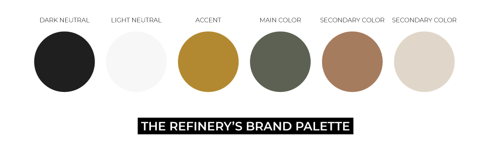
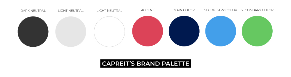
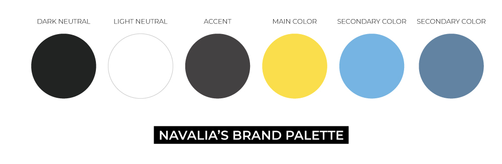
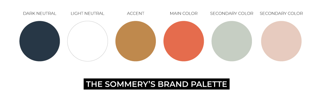
Here’s a few examples of brand palettes we’ve developed for our clients:
GTMA, HOW’D YOU GET YOUR COLOR PALETTE?
Great question, thanks for asking!
During our color marketing brainstorming, we started by considering the kind of company we are and the kind of brand we wanted. We are a digital marketing agency and production studio. We live in the digital space and are on the cutting-edge of marketing and content creation. We value service, integrity, authenticity, collaboration, and being ever-evolving. We are storytellers who love to have fun. It was important that our color palette reflected being an agency that is trustworthy, skilled, and also a group of great people.
Black and white had a natural place at the forefront of our brand – stark, clean, minimal, cool, and timeless.
Golden yellow became our primary color because it is optimistic, fun, and energetic, but we shifted it towards gold rather than pure yellow because erring slightly towards brown and orange brings sensibility, warmth, and quality. Golden yellow also had a place in our previous branding before the 2020 rebrand, so it serves as a callback to our history.
As for our secondary blue-gray color, it shares a compound relationship with golden yellow. This color carries the refinement and stability of gray, but a little bit of the reliability of blue, and is also a subtle nod to the blue that stood at the front of our branding previously. It complements the golden yellow while letting it take the stage.
This palette of four colors, led by black and white, supports us being an agency of storytellers working for and with clients – we don’t need a flashy and extraneous attitude to get our point across.
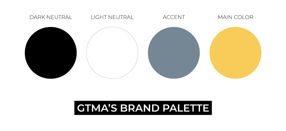
At its core, GTMA’s brand palette is refined, classic, modern, and jovial all at once, a perfect snapshot of who we are.
SUMMARIZING TIPS
To pull it all together, here are some useful tips to remember when it comes to developing or revisiting your brand color palette:
- BE TIMELESS, NOT TRENDY. Updating your brand is inevitable and part of the life cycle of any brand or business. But, to keep from having to refresh your colors every single year, make sure your palette will stand the test of time and doesn’t just reflect whatever colors or palettes are “in” right now.
- BE RELEVANT TO THE INDUSTRY. Your brand colors should not just reflect your values and mission, but should also fit well within your industry or line of work. It’s likely that no construction brand would use pinks and purples, like how no tech brand would choose browns. Choosing the wrong colors to identify your brand will make you stick out like a sore thumb and cause brand confusion with unwanted reactions to your brand.
- STICK WITH YOUR GUT. You know your brand better than anyone else does. You understand your audience and you know how people are supposed to feel when they interact with you. It’s crucial your colors are an accurate reflection of you and they are something you can live with and are excited to continue using.