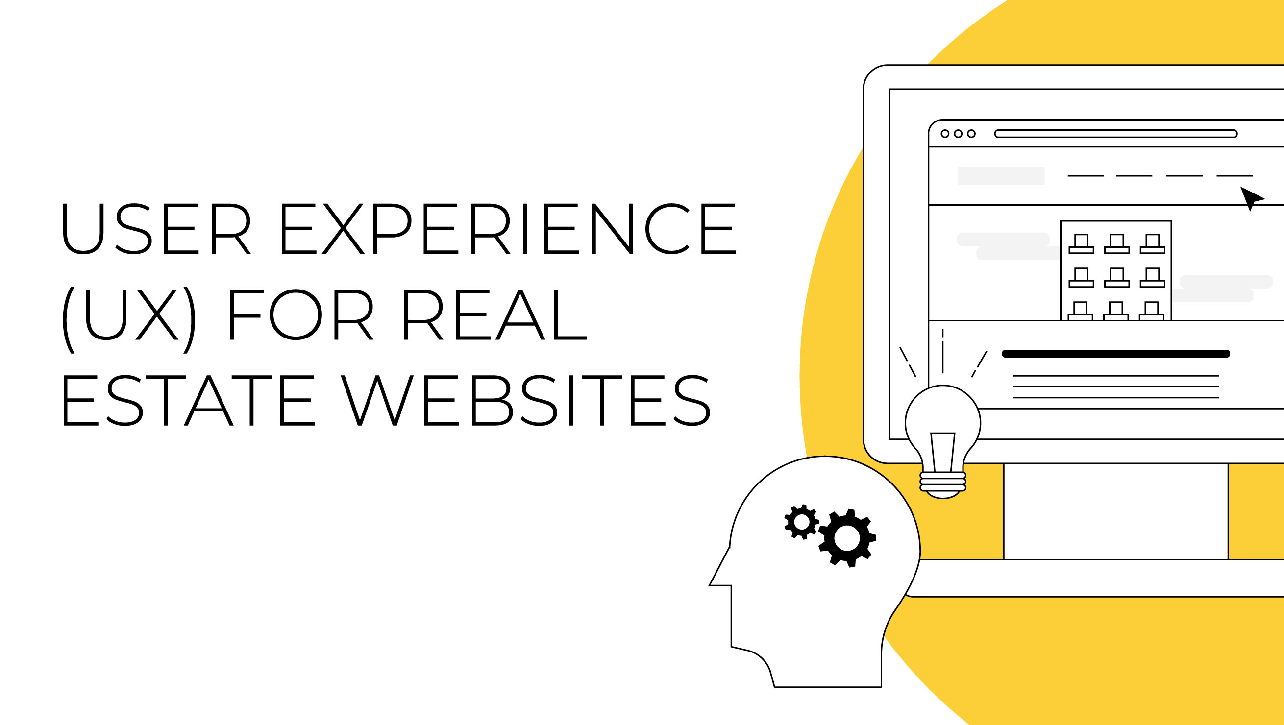
User Experience (UX) for Real Estate Websites
A good user experience makes all the difference when browsing any website, especially regarding real estate website design.
When you visit any website, there is likely something you wish to accomplish — finding product pricing, locating business hours, or booking a service. Sometimes it’s quick and easy to find what you’re looking for, and you leave happy and ready to tackle other tasks. You may smile at a clever animation or note how much you love a graphic or image.
Other times, it may be a frustrating experience — making you scroll and scroll, clicking through page after page, and you still can’t find what you’re looking for. You might keep trying and eventually figure it out, or you may leave out of sheer frustration and visit a competitor’s site instead. There is an entire school of design dedicated to ensuring your transaction will be as smooth as possible and preventing those bad end-user experiences: UX Design.
WHAT IS UX DESIGN?
The term “UX Design” stands for user experience design, a type of interaction design that considers how people interact with and experience an overall product. In simpler terms, UX design is the process of creating products that are practical, usable, and invoke a positive emotional response.
 vs. UI Design")
UX design is involved in your everyday life. Consider opening a door. How do you know where it goes? Should you push or pull? How easy is it to open? The answers to all these questions impact how we feel about the interaction. However, in the digital design world, UX design specifically refers to the usability of a website.
Good UX is rarely the first thing you notice about a website. In fact, it is meant to be unnoticed when it goes well but can have devastating effects when crafted poorly. Your website’s UX design plays a critical role in attracting and retaining your customer base. If users have a poor experience on your website, it negatively affects your reputation. Not only that, but they’ll turn to your competitors, and you’ll lose revenue.
WHAT GOES INTO UX DESIGN?
UX is a very broad field since it encompasses making a good overall experience. It branches out into several related categories such as marketing and research (to determine site goals and user base), copywriting and SEO (to ensure the correct information is present and formatted efficiently), branding and design (to communicate a visual message and direct attention around the screen), and web development (to make the site accessible and easy to update over time).
Always start by considering the purpose of the site as well as the goals of both the stakeholders and the target users. There are several questions to ask yourself when creating your website that will help you meet both sets of goals. What is the purpose of the site? Who are we building the site for? What is the most important information to show or get people to click on? What values do we want to communicate?
In the early stages of the UX process, designers invest time in user research, including defining the target audience (who will use the product) and learning about the goals and needs of the audience.
After that, UX designers try to satisfy those needs by defining the user flow and wireframing the structure before moving into prototyping and visual design. They typically follow a user-centered design process the entire time, carefully evaluating each decision they make to ensure the site is useable and solves the users’ needs at each stage.
THE ANATOMY OF A REAL ESTATE SITE
Ultimately, the UX is personalized for every website. For real estate websites, much of the same UX principles apply across the board, beginning with the goals and base structure of the site. There’s no need to reinvent the wheel when you have proven principles. You can use the same basic research and then apply creativity and personalization toward the end of the UX design process.
NAVIGATION
Navigation is the backbone of your website. It must be established before considering all the other details, big or small. Ask yourself these questions: Where are we taking people on their journey on our site? Where will they find the information they need?
The site structure allows people to easily find the most pertinent information and complete a transaction, or whatever the main goal of your website is. One of the first things we do is create a sitemap or basic blueprint to organize the best route for users. Consider grouping relevant information and provide a clear flow with the fewest steps between each path the user can take through your site.
Each page should have a distinct theme or goal. Pages like a contact page are standard on websites, and people expect to find them. Others are customized for each site. Ideally, you want to summarize each page with a single word. Use conventional language that everyone will be able to understand, not just those versed on the topic of your business.
For real estate websites, the primary categories of information people use to browse and achieve goals on your website include:

Main Menus
There should be more than one way to get around your website, but the primary route should be obvious by using a menu. It should be at the top of the page and accessible from anywhere on your site. This is called your “Global Nav Bar” or main menu, where the top-level site pages live. Clearly listing out all the pages helps orient users by letting them know the basic contents of the site at a glance.
Generally, it’s a good idea to follow common practice when defining the structure and functional aspects of the site. People who have been using the web for many years have an expectation of how it should function, so you can help them out and play to their strengths. Their eyes will automatically look for the navigation bar, so don’t make it confusing. Navigation isn’t the place to get fancy.
BEST PRACTICES:
- LOGO – The logo should be placed to the left or centered in the navigation bar. This clearly identifies the site, so people know they are in the right place. It also serves as a hyperlink to take users back to the homepage if they get lost.
- PAGE LINKS – The page links should be centered or placed to the right. It’s common practice to start with an “About” page or any other page you want users to see first. English speakers read left to right, so we start with the most important pages on the left side. It’s also common to end the row on the far right with the “Contact” page or a CTA (call to action) button with specific styling to draw the user’s attention to take action.
- SELECTION – Having a clearly selected state on tabs helps inform users where they are on the site if they feel lost.
- STICKY – Use a solid background and make sure the menu stays in place when scrolling so people can easily read the content and don’t have to scroll all the way to the top.
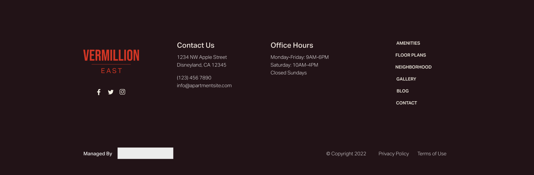
Footers
Footers are a great place to host additional navigation and quick information that people frequently look for. Often, users intentionally scroll to the bottom of a page to find certain information they expect to find in a footer, like a contact page and other page links. You don’t want to pack the footer with too much information or irrelevant content that would make the relevant content harder to find.
The footer is your final opportunity to shine and give website visitors a reason to visit other web pages within your site. Footers are flexible based on goals, but there are some common elements.
BEST PRACTICES:
- NAME/LOGO – Reinforce your brand and remind users where they are by using your brand name and/or logo. You can also put a quick blurb about your mission or values as a reminder or summary.
- CONTACT INFORMATION – Users expect to find your contact information in the footer and often intentionally scroll to the bottom of the page to find it. This can include your phone number, email address, office hours, and social media links.
- DOORMAT NAVIGATION + QUICK LINKS – Doormat navigation is the same top-level page links that are in the main menu. You can also include quick links for popular pages (that may not be the same as the main menu) so users don’t have to scroll to the top or look for frequently used links once they’ve reached the bottom of the page.
- LEGAL AND SITEMAP – The Terms of Use and Privacy Policy are requirements on your site for legal purposes and the sitemap helps search engines discover URLs on your site. These items should be the last things on the page since it’s not something people are often looking for, but they know where to find it.
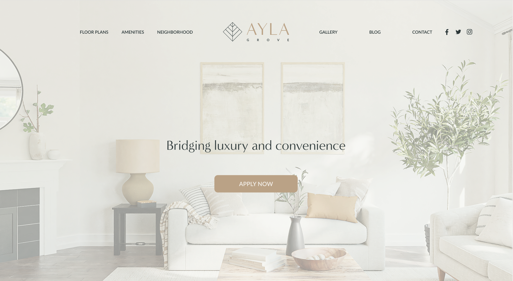
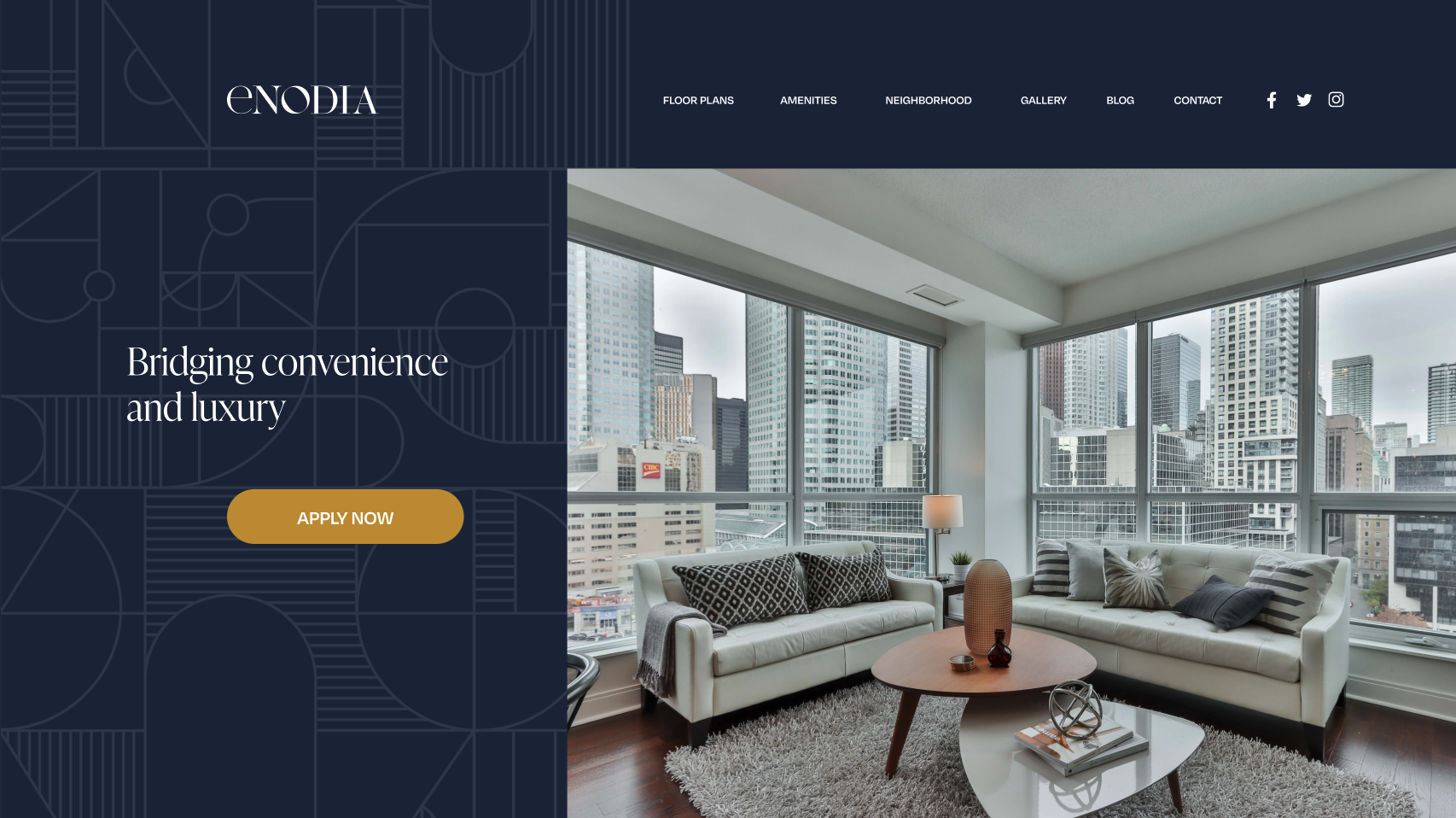
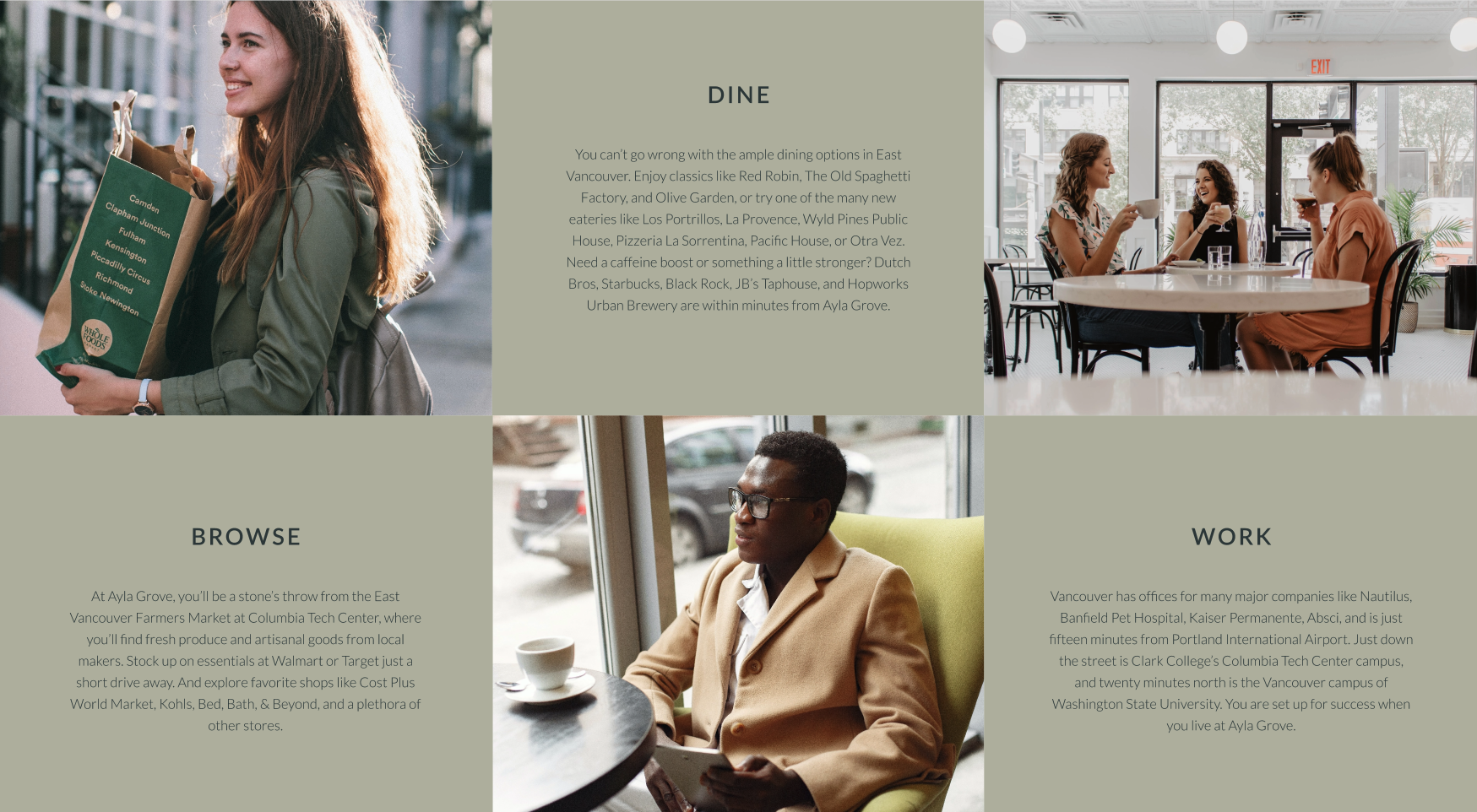
HOMEPAGE
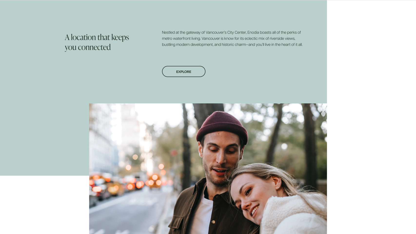
The homepage is the most valuable real estate on your website. The purpose of the homepage is to give users a place to land, make sure they know where they are, see an overview of your offerings, and have the incentive to keep looking with a clear method and direction to continue on. Use visual cues — such as arrows, color blocks, or patterns — to draw attention to the most important content areas or get visitors to scroll. Lots of photos and opportunities to show off the location should be present on this page as well as throughout the real estate website. This helps immerse users and gives them a taste of what living in the area may be like. People are highly visual.
BEST PRACTICES:
- ABOVE THE FOLD – The first section of the homepage should clearly identify the site and establish the brand. It should also include a tagline that presents a benefit-oriented value proposition. Using a strong, brief CTA immediately gives people something to do next. You want to use strong visuals here; often a full-screen image or video background.
- ESTABLISH VALUE + CONTEXT – Immediately. Prove you have something valuable to offer with more specificity than the tagline. Here you have a little more wiggle room to give an overview and show the overall value that goes beyond the exact services you offer. Provide a quick way to further establish that people are in the right place for what they are looking for. You can use images or icons to help with ease of digesting information and provide visual interest while further building upon your branding.
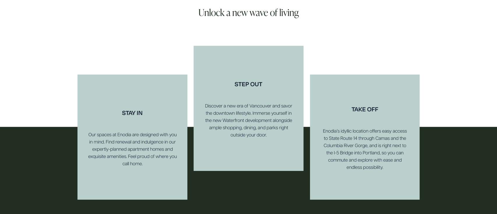
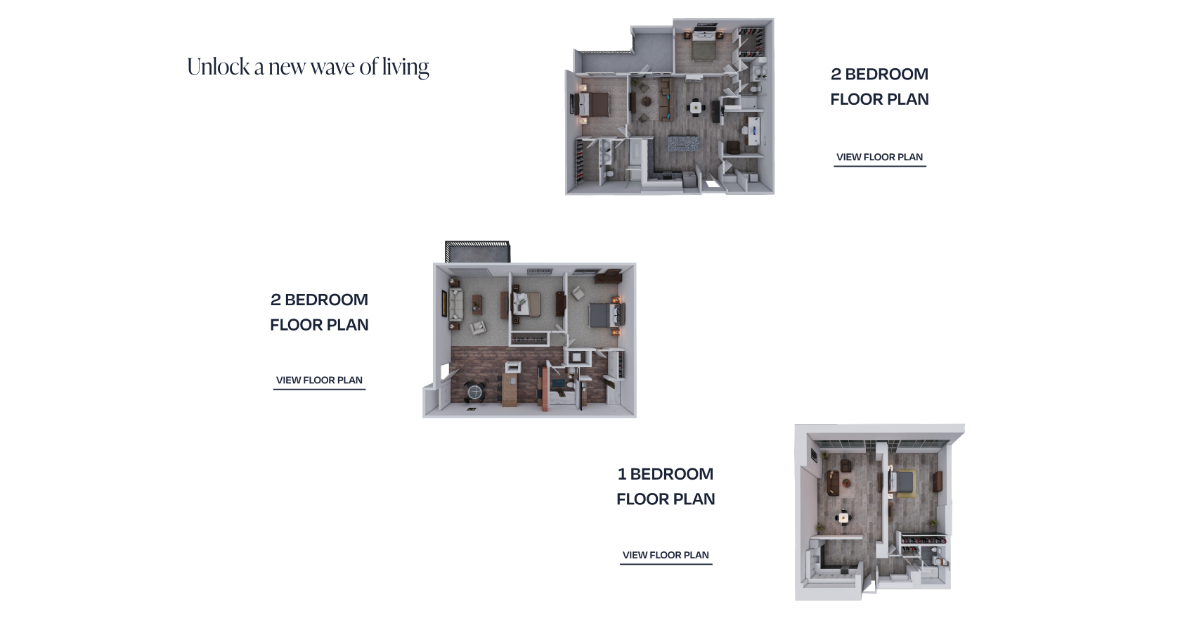
- PRESENT TOP PRODUCTS/SERVICES – Quickly show your top floor plans. People have seen who you are and what you can offer, so now they want to see if your services match their needs. If you use a carousel here, be aware that the first option is the only guaranteed view since people may not choose to scroll. Don’t use the automatic scroll because it takes away the autonomy of browsing at their own pace from the user. Include a button to view more to immediately encourage users to move forward.
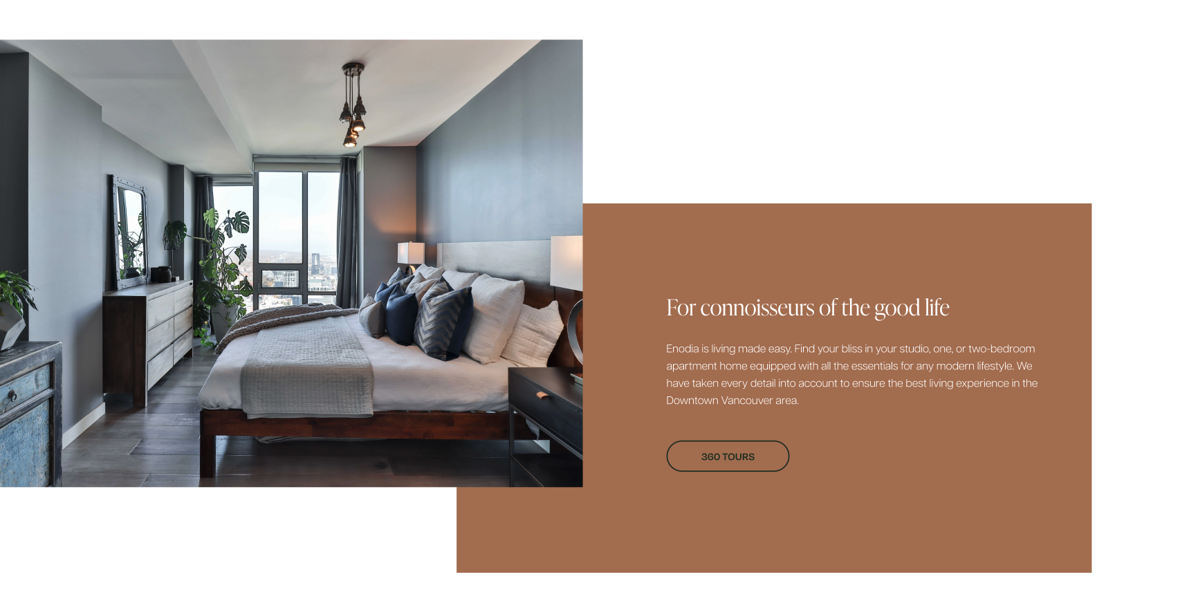
- 360 TOURS – As you scroll down the page, you have the space to get into the details of your value offerings. If you have a 360-degree virtual tour, this should be prominently displayed so people can determine if your product matches their initial assessment. 360 tours are an immersive way to preview your location as closely as possible while giving people autonomy in their experience.
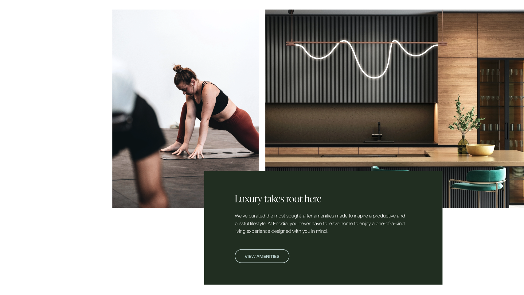
- AMENITIES – Including a description of your amenities is a continuation of your service value offerings that people often look for upfront. Use a different format than what you used for 360 tours with plenty of images to give context and generate interest. Remember, people are visual and this is another opportunity to show off the location. Use a button to encourage people to explore.
- LOCATION VALUE – Continue to establish value with a blurb about your location, providing more details about the general area rather than the specific services. Use a button to encourage people to explore.
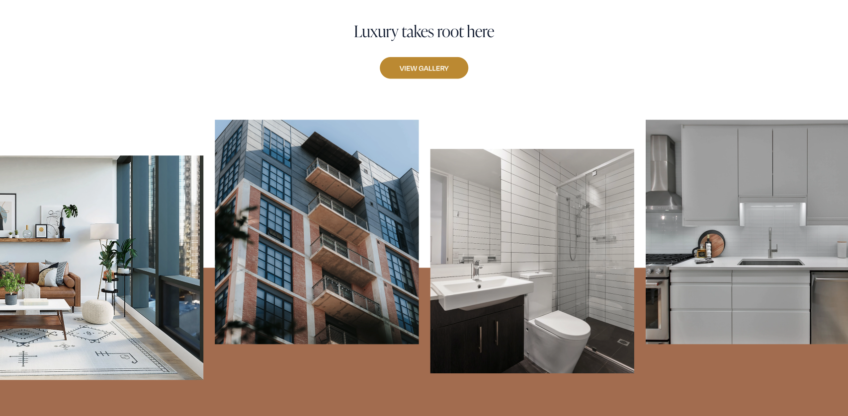
- GALLERY – This is where you start to wrap up the homepage and let the location speak for itself. The gallery on the homepage is an opportunity to show rather than tell and play to the fact that people are visual learners. Allow your visitors to look at the location at their own pace. Make sure to use a button for the same reasons mentioned before.
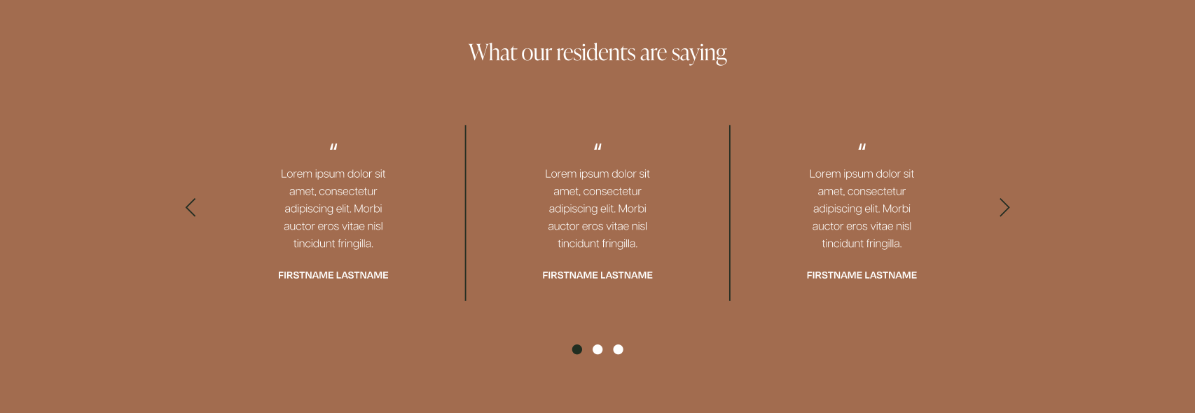
- TESTIMONIALS – Testimonials aren’t necessary, but they are a really good way to provide social proof. It’s no longer just the brand speaking, now they have more trust because there is feedback from others sources. This acts as a last effort to push what you’re selling and convince people to take action before they reach the end of the page. Showing multiple testimonials also gives visitors a feeling of autonomy.
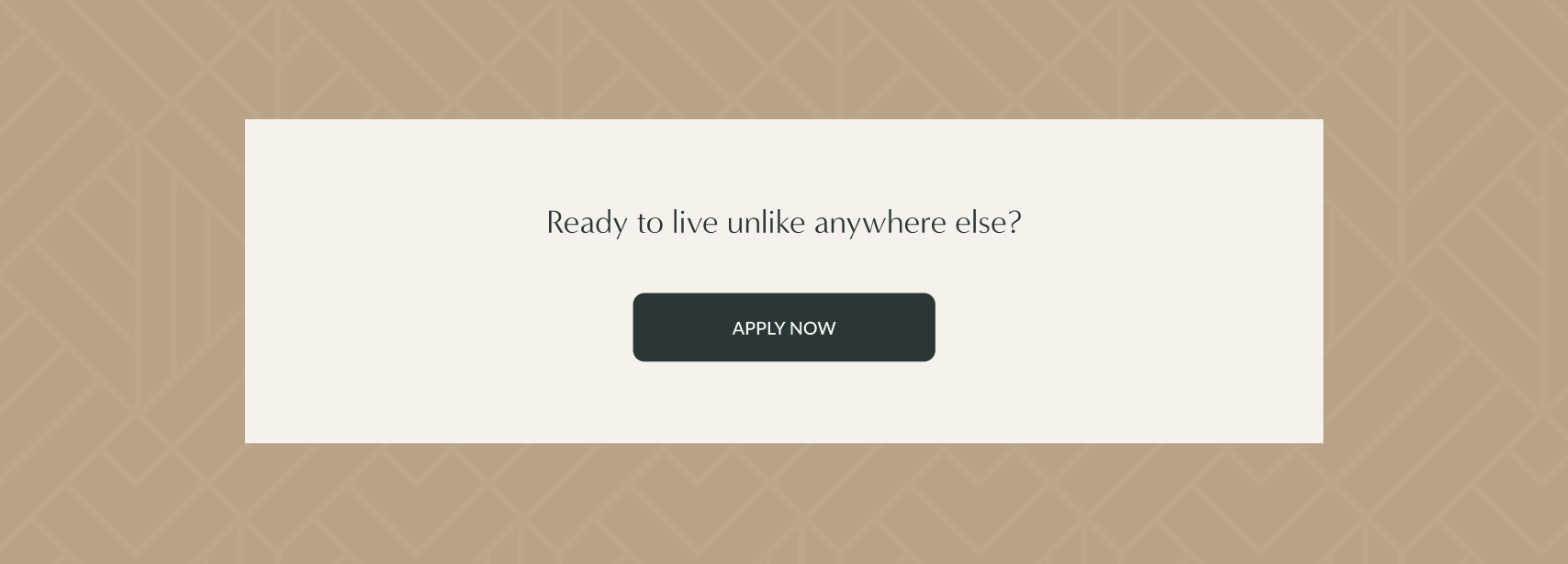
- CTA – Finish off the page with a CTA. It is critical to give people a clear push, guiding them in a direction to take action when they reach the bottom of your page, so they aren’t set adrift. You want this section to be clear and direct to accomplish the primary goal of the site. Including CTAs at the end of the page is applicable throughout the site.

FLOOR PLANS
Although each page is important, the floor plans page is arguably one of the most essential pages on the entire site. This page meets the primary goal of the site which is to clearly present your services and encourage people to buy them. There is an opportunity to show a little creativity, but mainly this page should be utility-based and all about efficiently displaying and filtering your products.
BEST PRACTICES:
- QUICK INTRO – Include a quick introduction to re-establish the value of your brand and give context to the page.

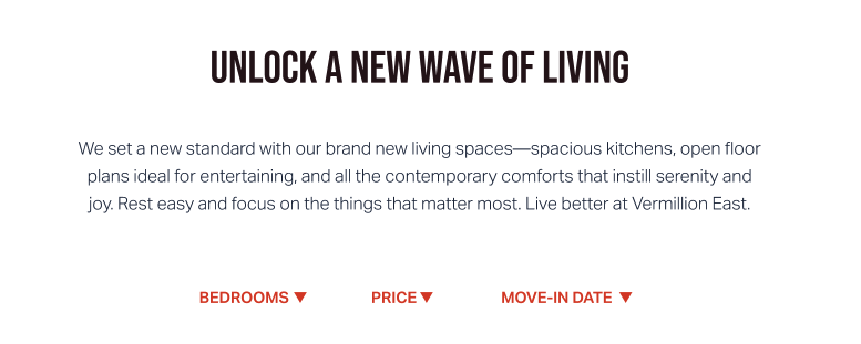
- FILTERING – Always allow filtering. This makes browsing easier and lets people find exactly what they need without being confronted with irrelevant information. The most common and applicable filters are bedrooms, price, move-in date, and price range. You want to be sure the filters are formatted to the specific type of data, whether it be a checkbox, calendar, slider, etc.
- CLEAR RESULTS – Clearly display your results in a gallery view.

- CONCISE INFORMATION – You need to show an image of the floor plan, bed count, bath count, square footage, and location. Include a clear CTA to check availability or to apply. This doesn’t have to be too complex — you’re giving an overview of the most relevant information while letting people browse through it to see if it meets their needs.
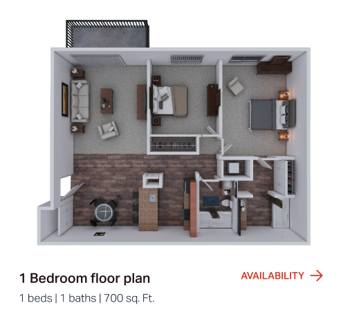
- LIGHTBOX – When the floor plans are clicked, the lightbox shows more information and a bigger image. We don’t want to disrupt users by taking them to a new page, because they are still in the browsing stage and the last thing we want to do is confuse them when they try to go back. Make sure the lightbox has a clear “X” in the corner to easily undo their action and keep scrolling. Give the user a prompt to take action with the availability button.
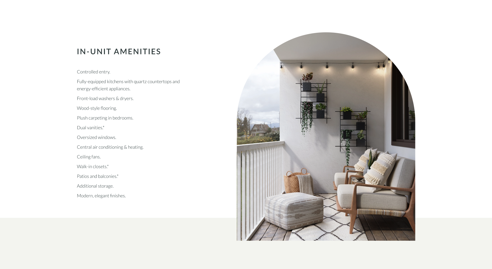
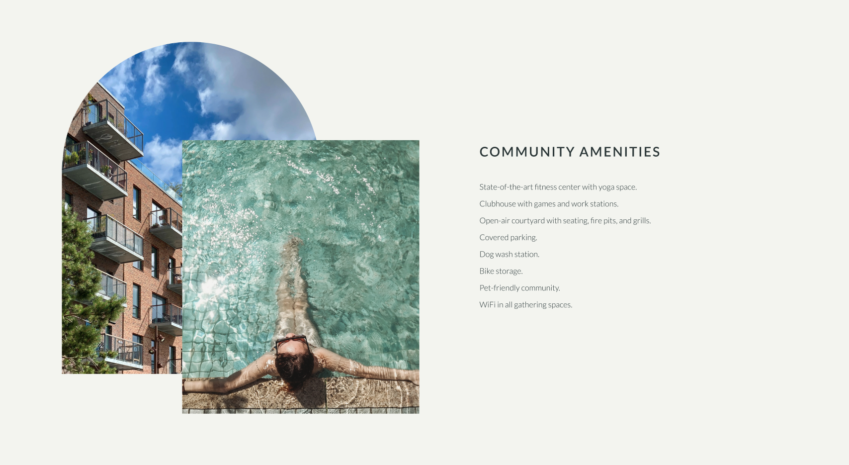
AMENITIES
BEST PRACTICES:
- QUICK INTRO – Include a quick introduction to re-establish the value of your brand and give context to the page.
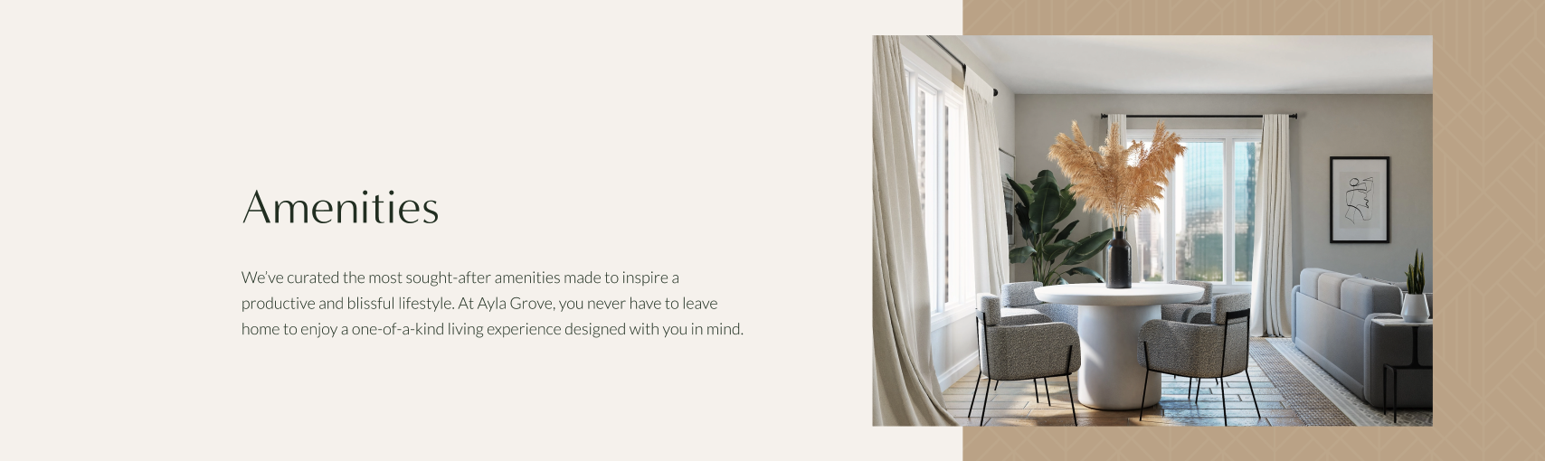
- LISTS – Use bullet point lists for both in-unit amenities and community amenities. Keep it simple and easy to digest for users that will be scanning the page. Rely on imagery to immerse users and provide visual context that backs up the text.
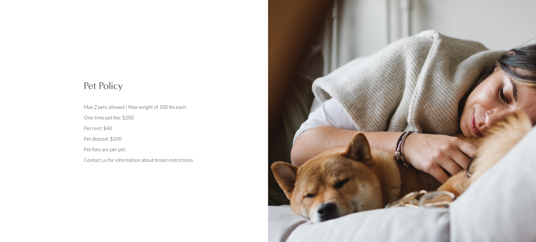
- PET POLICY – If your community has a pet-friendly policy, make sure it is included on this page. Break this out into bullet points as well. This is another opportunity to introduce more imagery and visual variety.
- CTA – Finish off the page with a clear CTA. This gives people a clear push in a direction to take action when they reach the bottom of the page. Similar to the homepage.
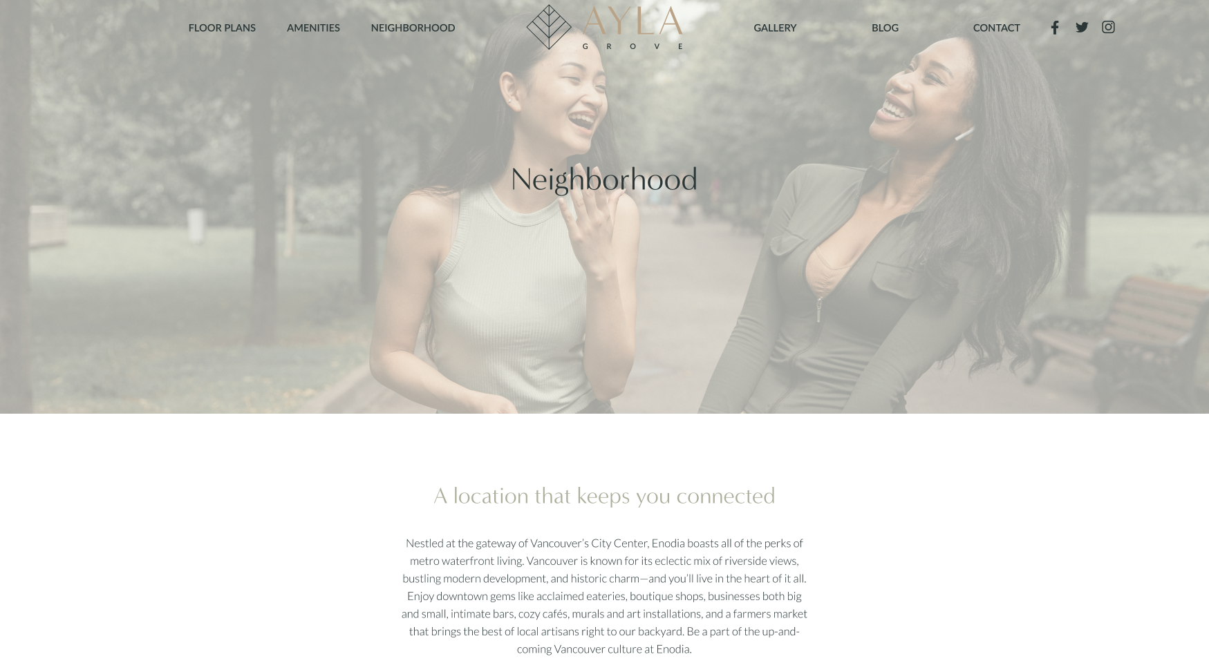
NEIGHBORHOOD
BEST PRACTICES:
- QUICK INTRO – Include a quick introduction to re-establish the value of your brand and give context to the page. Expand on people’s desire for the overall area rather than your specific services.
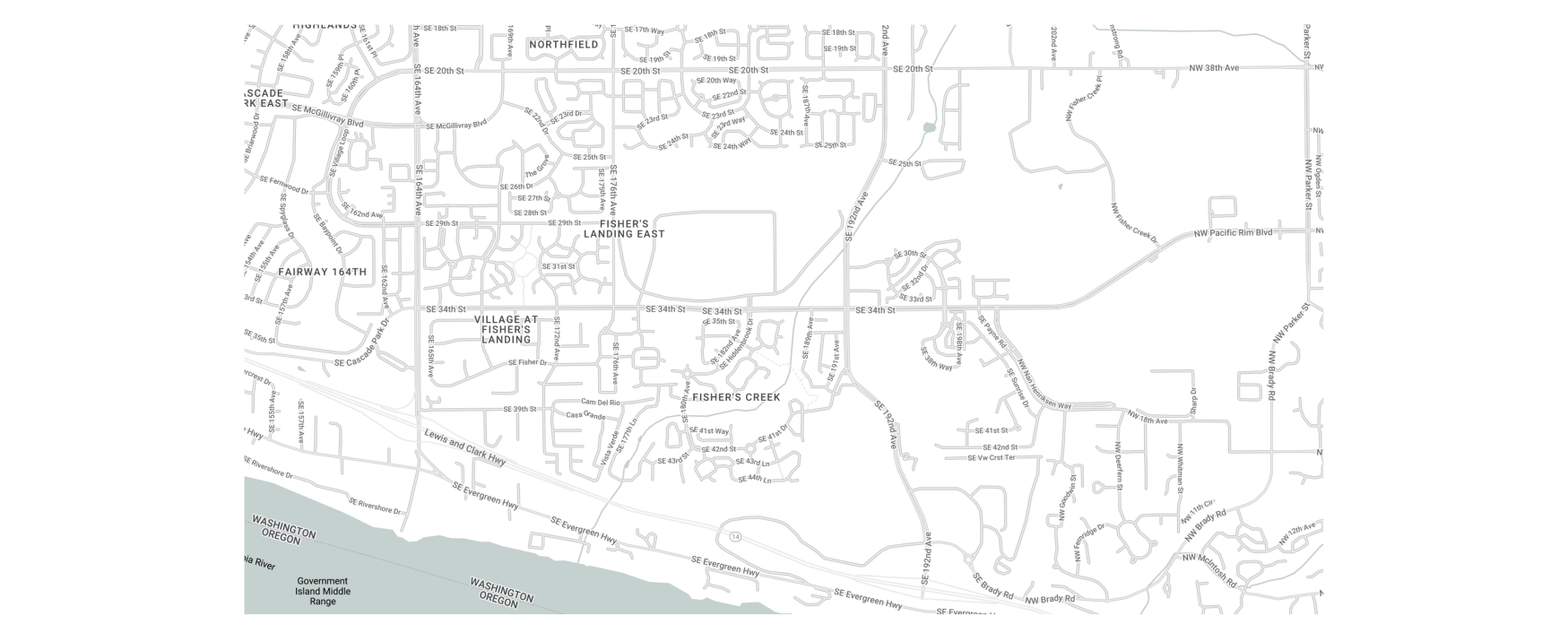
- POI MAP – Showing a map with points of interest is another immersive opportunity to show off all that the area can offer them as residents. This section gives people autonomy and a chance to interact and explore the area. Utilize a filter by category to give a baseline and guide for what people can view so they aren’t lost.
- LOCATION HIGHLIGHTS – A section featuring location highlights allows you to expand and show what the area has to offer in a more curated fashion. Imagery helps provide visual interest. You could speak about specific locations or categories that draw people to the area.
- CTA – Once again, finish off the page with a clear CTA that gives people a push in a direction to take action when they reach the bottom of the page.

GALLERY
BEST PRACTICES:
- FILTERING – This is necessary but doesn’t have to be too complex. Use a toggle to switch between different categories of images. Make browsing easier by allowing people the ability to see exactly what they want to without being distracted by irrelevant information.

- DISPLAY – Show off your imagery in a gallery view. This is a space you can get creative with the layout. It’s okay to present the images as puzzle pieces of different sizes, etc., as long as you’re displaying an overall variety to allow visitors to efficiently scan the page.

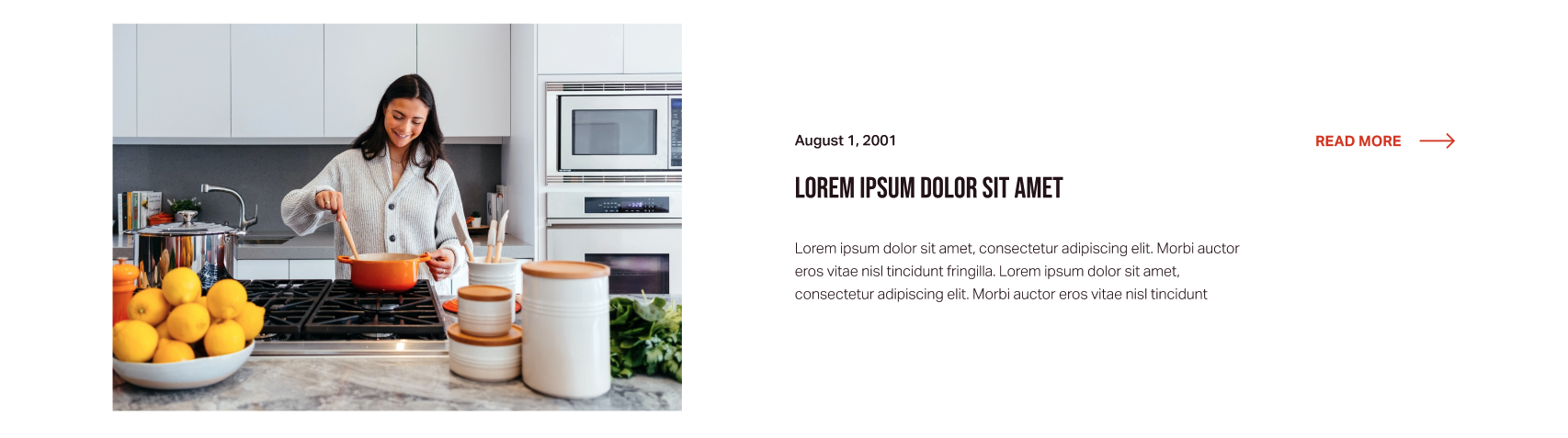
BLOG
The blog page on a real estate website is fairly simple. It doesn’t need to be too complicated since it is not the main goal of the site. Keep the conventional layout of a blog to help users easily scan the page. Including a blog helps your website with SEO in the long term, so it is a nice feature to have.
BEST PRACTICES:
- FEATURED BLOG – Have a featured blog pinned to the top of the page to draw the users” attention. This can be the most recent article or a significant topic you want to call attention to. Make sure the pinned post uses prominent styling — such as larger fonts and imagery — that differs from the rest of the articles to indicate that it is special.

- DISPLAY – Present the articles in a gallery or list format so users can quickly scan and find what they are interested in. This page is heavily utility-based. Make sure there is pagination at the bottom of the page to break content into more digestible chunks, giving users a placeholder to go back to rather than endlessly scrolling.
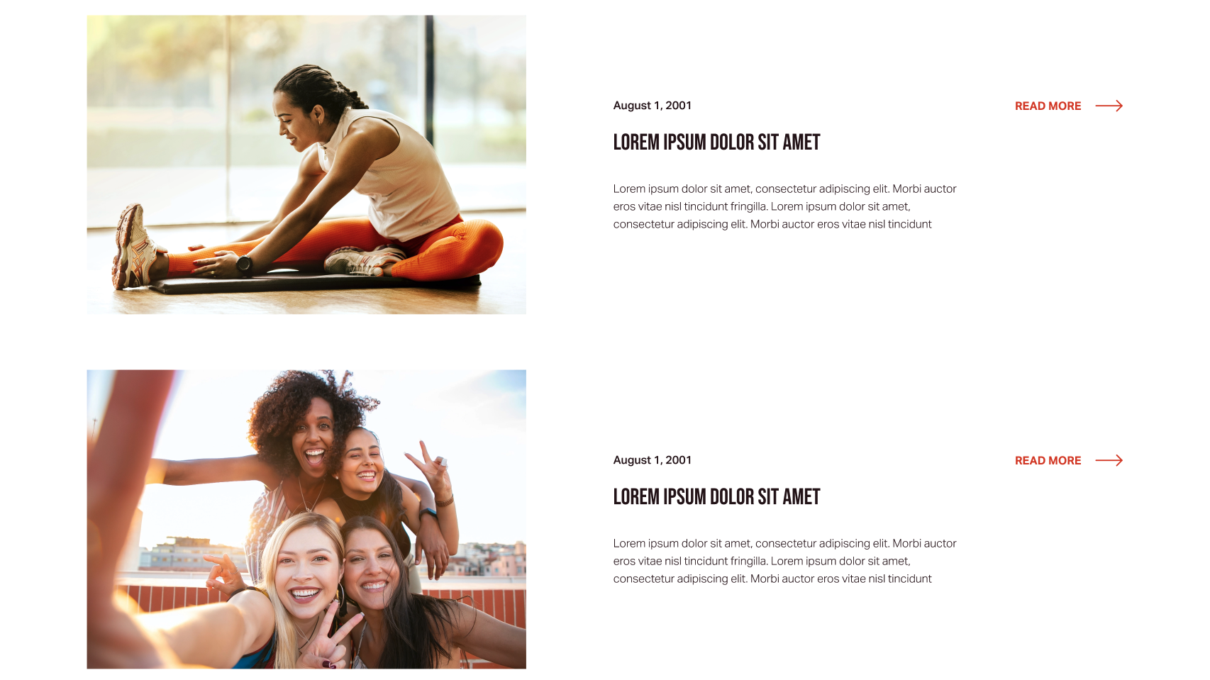
- CONTEXTUAL VISUALS – Imagery helps provide visual interest and context. Use large headers with the publish date, and a clear button to read more so users can take the next action. You can also add a blurb from the beginning of the blog so that people can confirm right away if the article is what they’re looking for and add more confidence to their clicks. Reducing the likelihood that they have to click all the way into the blog to find out if it’s what they need is key.
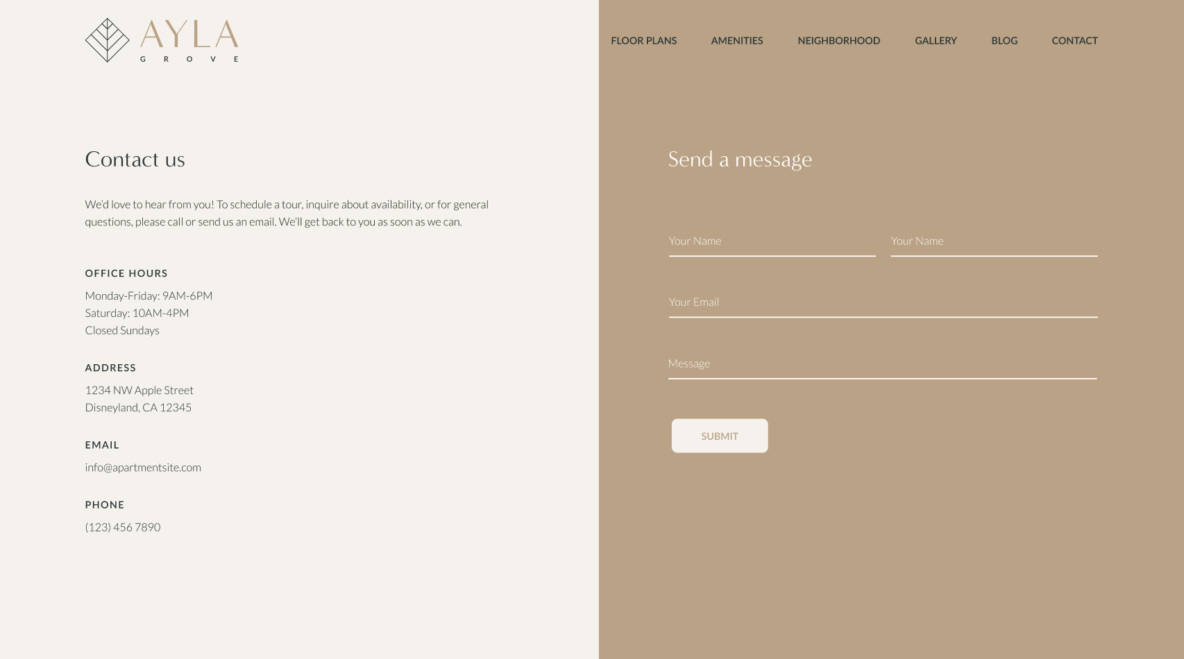
CONTACT
BEST PRACTICES:
- QUICK INTRO – Include a quick introduction to communicate the benefits of contacting you and encourage people to do so.
- CONTACT INFORMATION – Ensure your contact information is clearly listed. It is critical to have this information in addition to a form because it gives users autonomy and a feeling of control over the interaction. Forms can be intimidating and feel impersonal, leaving the users wondering if they will ever get a reply.
- FORM – Allow users to contact you quickly and efficiently without leaving the site. You can use a form to include specific fields that help you get more of the right information and can customize where the submissions will lead. However, it is also a good idea to reduce the number of fields overall to include only the most necessary ones. Mark the required fields with an asterisk and use inline validation to reduce errors upon form submission and increase the speed of correction.
THE TAKEAWAY
You want your site to be successful where users leave satisfied after completing their goals. UX is all about crafting the user experience of how people interact with your website so that it is as functional as possible. UX is involved in almost every aspect of your site, including branding and visual design, copywriting and SEO, and web development. When the UX is positive, it should go unnoticed.
When starting the journey of building your site, take the time to ask yourself some questions. What do you want the site to accomplish? Who is it for? What is the most important information to show or to get people to click on? Consider your goals ahead of time and come ready to address various solutions to make the site efficient and meet user needs. There is a solid structure and proven principles laid down for real estate to base your site on with the client and users’ needs for common goals in mind. A user-focused approach to creating a good UX will result in your needs being met as well as your customers.
Want to learn more about GTMA’s web design and development services? Fill out the form below to give us a shout.
CONTACT US