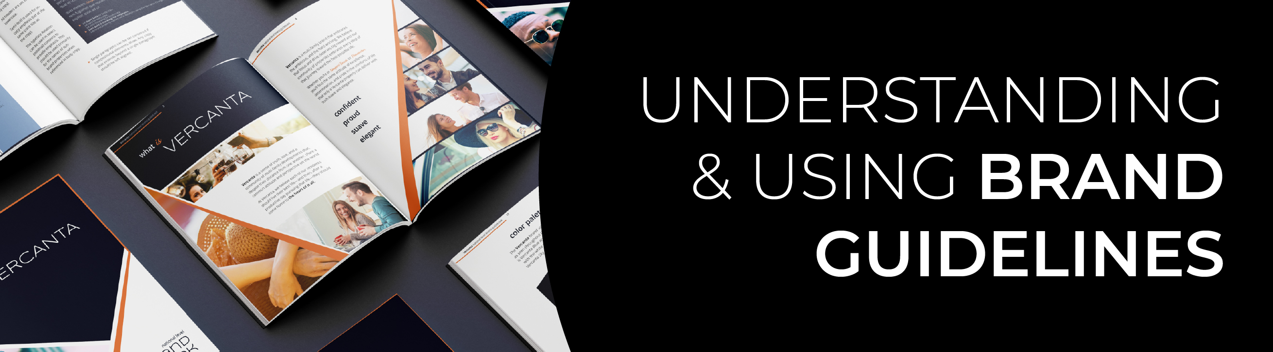
Understanding & Using Brand Guidelines
You’ve just started a new role in the marketing department at a new company. You’ve been given this hefty document (likely a digital PDF, because who prints stuff anymore?) called… BRAND GUIDELINES. It seems like a daunting piece of literature at first, but you will come to learn that this document will become your lifeline when it comes to communicating with and marketing to your audience.
There’s always so much talk about what makes good branding, but sometimes we neglect to talk about what happens next after the brand has been developed and you’re ready to get it out into the world. Your Brand Guidelines serve as the launching pad for how to convey the identity of your brand in every way.
Why Have Brand Guidelines?
Brand Guides are useful for businesses in any industry and in any phase of growth. Some companies opt to have very simple Brand Guidelines or don’t use Brand Guides at all. However, if your brand’s consistency, efficiency, and depth are a priority to you, it is highly recommended you take the time to develop a document that houses anything and everything related to your brand communication.
The first door the brand guide unlocks is consistency. Strong brands don’t happen spontaneously — they know exactly who they are with plenty of planning and intention going into it. Consistent brand usage shows your audience you give care and attention to how you are presented and ultimately builds trust when they have a cohesive, clear, and seamless experience. When your branding is used inconsistently, the audience can become confused and turned off when they don’t recognize it — consistency drives repetition, and repetition drives brand recognition. Using Brand Guidelines ensures that everyone who touches your branding uses it in the same way, following the same rules, and pulling from the same set of brand assets.
In a similar vein, Brand Guidelines also take the guesswork out of creating marketing communications. A good Brand Guide saves time by outlining all of the components and how to use them. They provide a baseline standard when it comes to designing or writing for your brand that you can always refer back to when making decisions about communications. It may seem like Brand Guides create limitations on our work, but they actually allow more creativity by establishing a starting point with regulations rather than starting from scratch every time.
Another goal we achieve with Brand Guidelines is brand depth. While every company has a “brand,” a robust set of guidelines allows your brand to stand out as clearly defined. The Brand Guide becomes the vessel in which you can develop and strengthen your brand by creating an identity beyond your product or service. Keeping your brand guidelines up-to-date is key in order to phase out any outdated components and clarify pieces that have been up for debate. Your Brand Guide is a living, breathing document that should grow and adapt just as your brand does.
Who Should Use Brand Guidelines?
The simple answer is, everyone at your company should at least take a look at the Brand Guide. It’s a misconception that Brand Guidelines are just for graphic designers. While yes, Brand Guides are typically largely focused on the visual elements of a brand, a comprehensive Brand Guideline document will contain anything and everything related to how your brand communicates, beyond just the visuals. Anyone who touches any marketing communications both internally and externally should actively refer to the brand guide and be familiar with its contents.
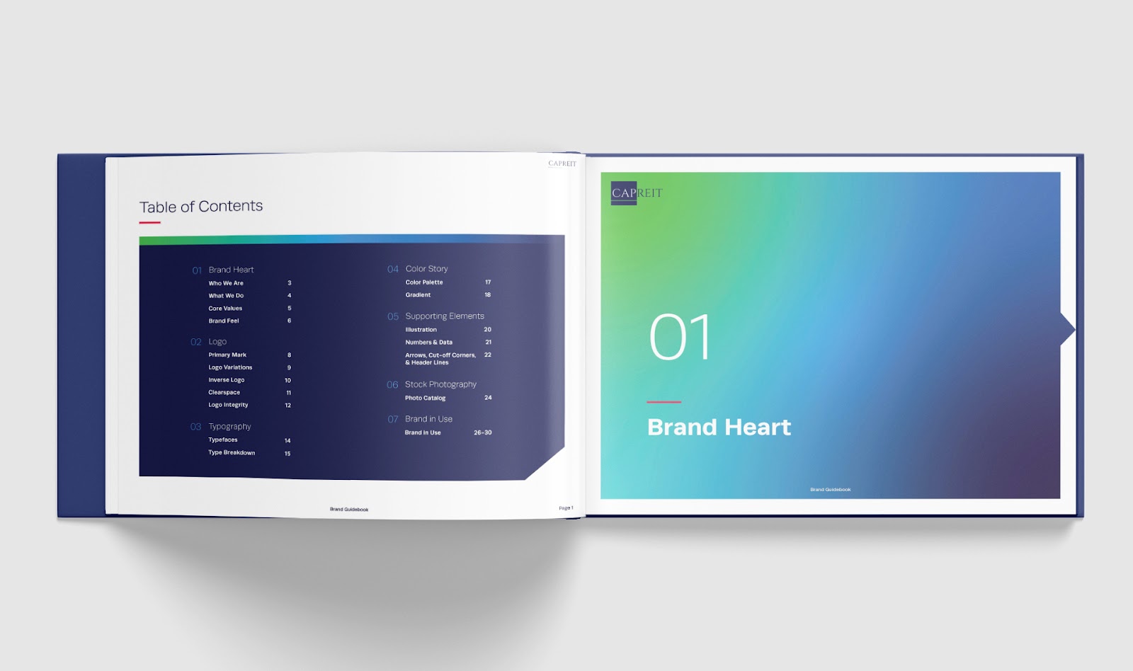
What Should Be Included in Brand Guidelines?
The contents and breadth of a Brand Guide will differ for every business, however, one could typically expect to find these sections:
- Brand voice
- Brand messaging
- Logo and usage guidelines
- Typography system
- Color palette
- Any illustration, iconography, textures, patterns, or other graphic motifs
- Photography style and/or stock photography catalog
- Mockup examples of the brand in use
Now we’ll dive into each of these sections and tips for understanding each one.
Brand Voice
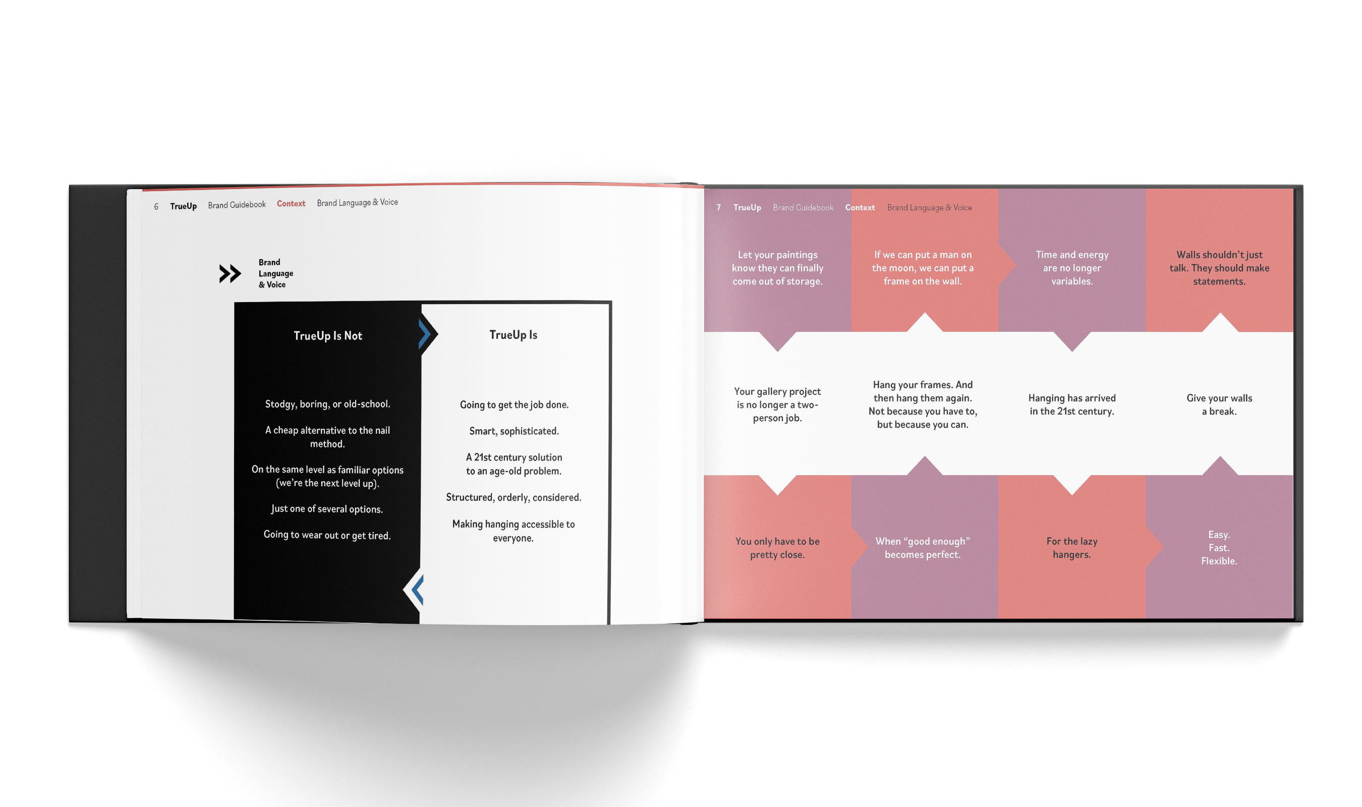
Brand Voice is the distinct personality a brand uses to communicate with across mediums. If your brand was a person, what would their personality be like? What is their visual aesthetic? What are stylistic choices they would make in the way they talk, act, and look? Brand Voice sets the pace and tone for how the brand communicates both visually and verbally. Brand Voice is typically found through identifying the target audience and how we want them to feel when they interact with us. It’s the way a brand targeted to Gen Z would likely look and speak differently than a brand targeted to the Boomer generation.
In a Brand Guide, Brand Voice is typically laid out as a list of buzzwords that describe the personality we are aiming for, or a written statement explaining the brand voice more in depth. These could use words like “authentic,” “helpful,” “playful,” or “simple.” They may even be paired with another list of buzzwords that capture what the brand voice is not to paint a clearer picture of what to avoid when communicating as the brand.
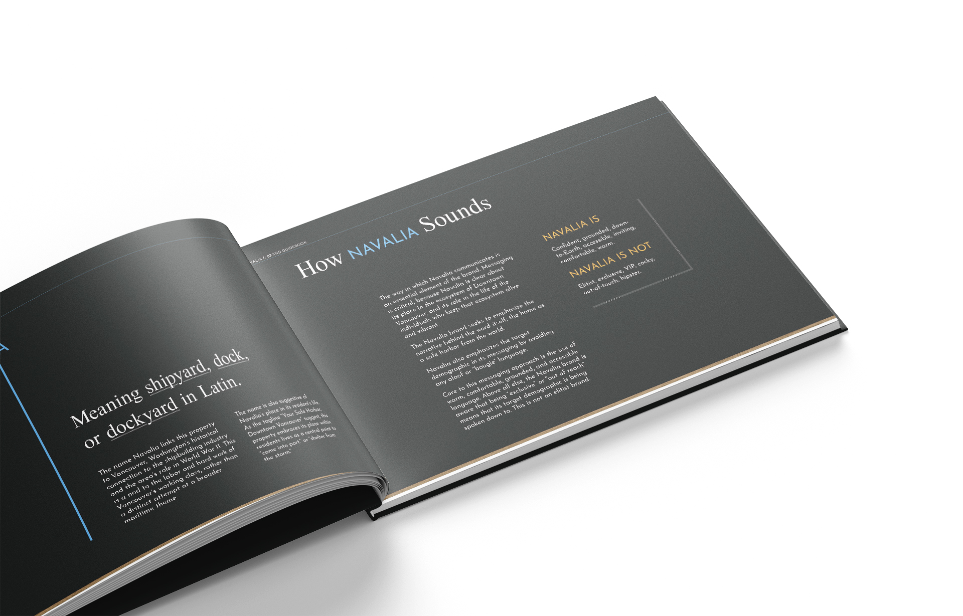
Brand Voice can sometimes shift depending on the marketing channel, as long as the same Brand Voice essence carries through both. The same brand may appear more playful and use emojis on social media, but take a more formal tone in online blogs. It’s about knowing your audience and knowing where to adapt the brand voice based on how the audience is interacting with you.
Brand Messaging
Brand Messaging is where you begin to see the Brand Voice in action. It is streamlined prewritten communications about the brand. Messaging will explain in writing who the brand is, what it does, and why. It is the way in which the brand talks about itself.
Messaging may include but is not limited to:
- Positioning Statement – a description of the product or service and target audience that explains how you fill a market need. Think of it like an all-encompassing elevator pitch for the brand.

- Mission Statement – a definition of the company’s business, who it serves, what it does, its objectives, and its approach to reaching those objectives. It is the overall “why” behind the brand.
- Vision Statement – a description of the desired future state of the company. An effective vision inspires the team, showing them how success will look and feel.
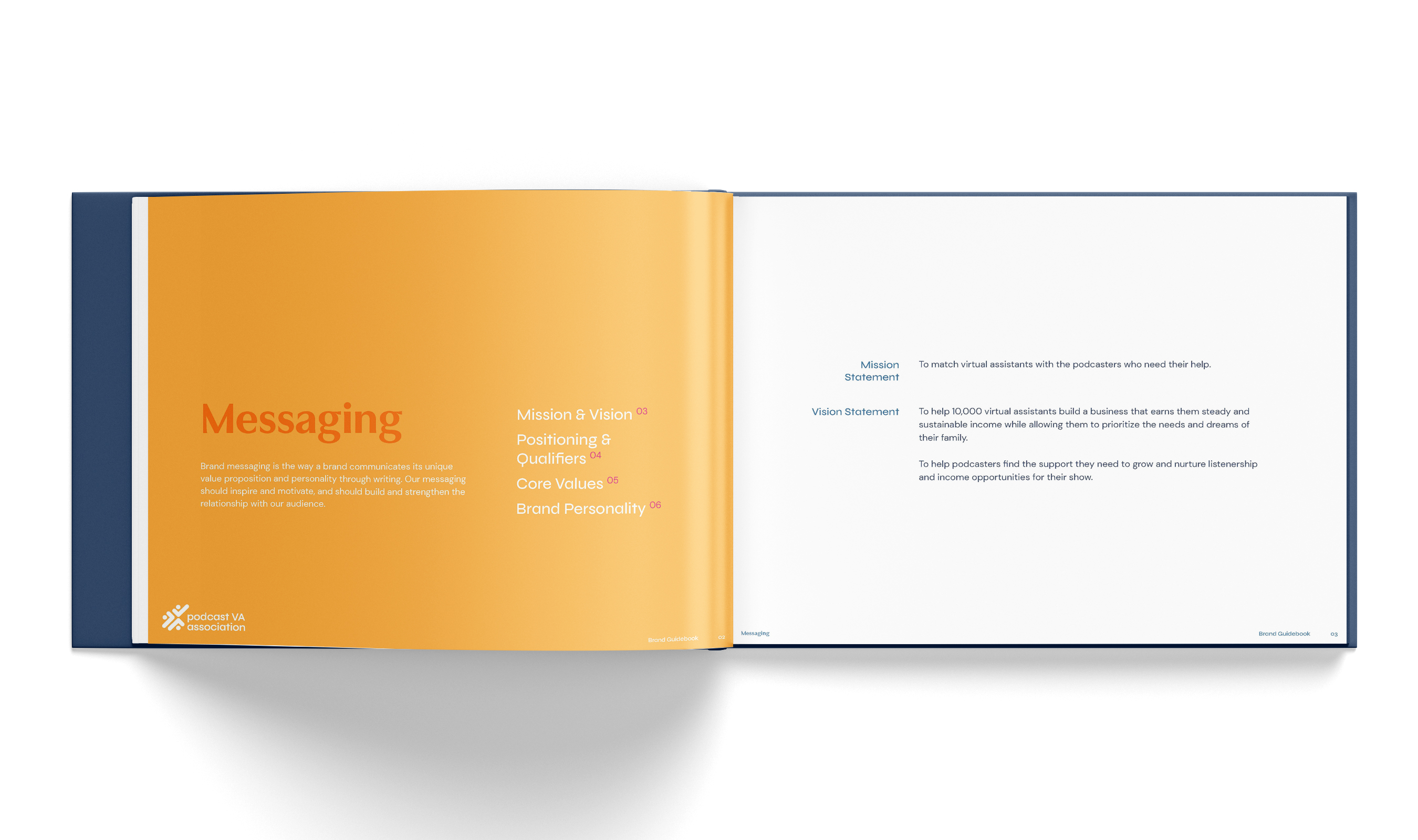
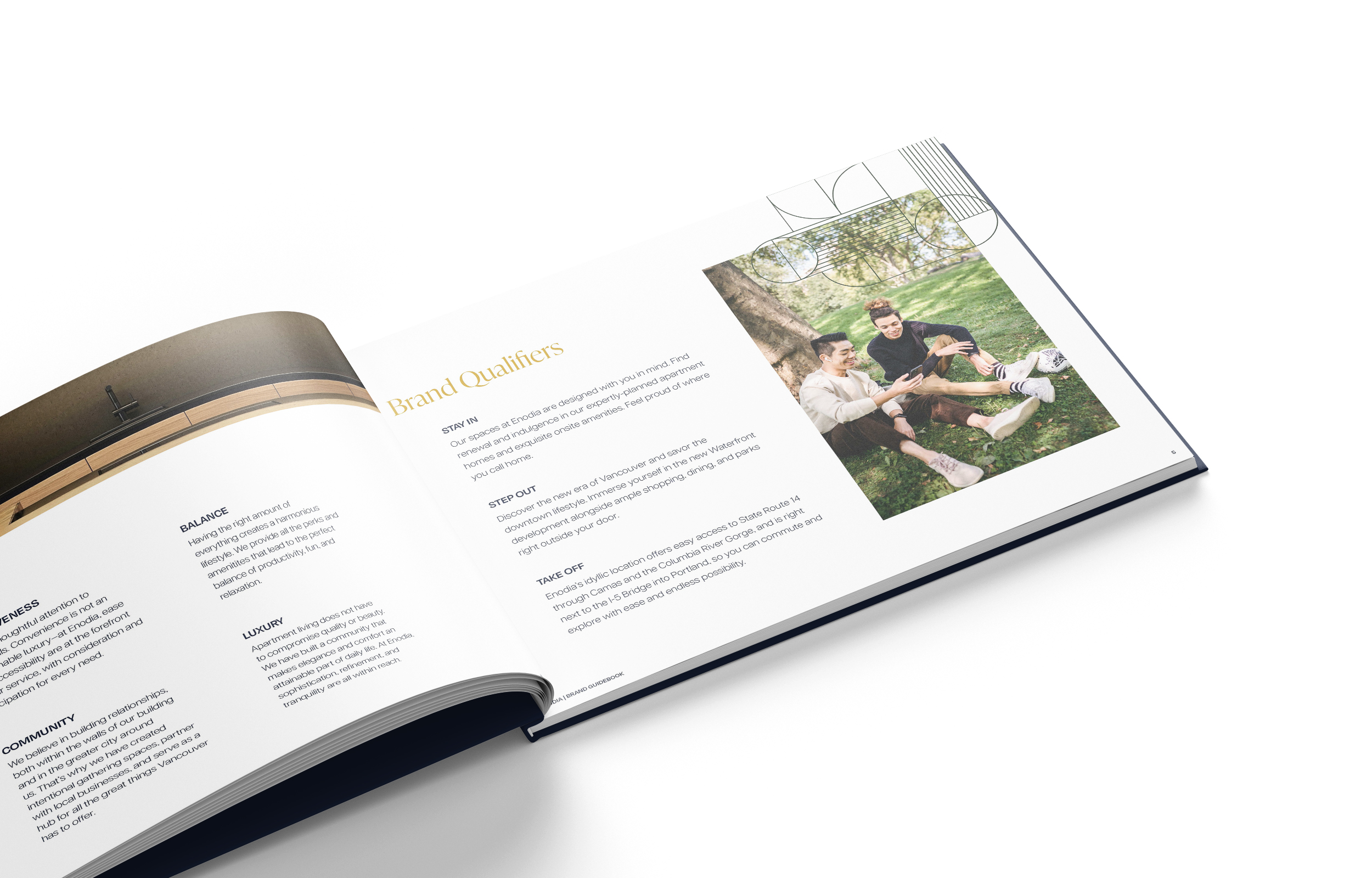
- Brand Qualifiers – represent the unique aspects of the brand. They are the nuances that make us different and help define us. They essentially explain why someone would choose your brand over another.
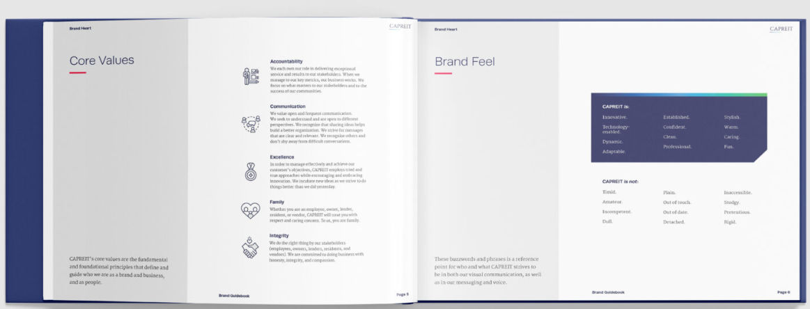
- Core Values – the beliefs, principles, and ideals that the business holds closest. They are the ethics or ideals that guide making decisions, building relationships, and solving problems.
- Taglines – short, memorable descriptions that succinctly and clearly communicate the brand message. Taglines are also known as catchphrases or slogans. They are what you might see in advertising that helps set the brand’s position in the marketplace.
Messaging is necessary for both internal and external use. It determines how people learn about the brand and team members speak about the brand within the company. Messaging is useful in the sense that marketers can simply pull from these written statements and use them directly in communications rather than writing new content each time.
Logo and Usage Guidelines
Perhaps the most essential piece of the Brand Guide is the logo and how to use it. The logo is the graphic mark, emblem, or symbol used to promote public identification and purpose for a brand. The logo can serve as the single identifier that encompasses a brand, so it is crucial that it is treated with care and that all guidelines are followed when it is used.
In most cases, there will be more than one version of the logo in a brand. They usually come in sets with different elements and arrangements to use in different contexts. There may be a primary logo to use everywhere possible and a secondary logo to use when there is less space or when the logo is not the focus. There may be a wordmark, which is an all-text version of the logo where any symbols or graphics are removed. There may be a symbol or submark version where the typography is removed and you’re left with just a graphic. Sometimes logos have horizontal and vertical variations to use based on what kind of space you are putting it in. The number of logo combinations is endless, but overall this section should detail which variations exist and ideally provide insight on when and where to use each one.
Also included in this section could be the color variations of the logo. A good logo will exist in at least 2 color variations to use on varying backgrounds – a light version to use on darker backgrounds, and a dark version to use on lighter backgrounds. Other color variations may also exist. In a Brand Guide, this section should show which variation should be used on which type of background to ensure maximum legibility and contrast of the logo.
The other key piece within the logo section of the Brand Guide should be usage guidelines. We sometimes refer to this as logo integrity, because when these guidelines aren’t followed, we compromise the integrity of the logo’s visibility and impact, and therefore hurting brand recognition and quality. There is a wide range of logo integrity guidelines that may be included:
- Clear space ensures sufficient room around the logo to maintain its visibility and avoid visual clutter. It is the area defined around the logo that no other elements can encroach and the room that must be maintained between the logo and any edges. Think of it as the margins around your logo that you allow for wherever the logo is placed. This should be clearly visually defined in the brand guide. Typically a unit of measurement, such as the height of a letter or some other component of the logo, is used as the margin size so that no matter what size the logo is, you always have a frame of reference for how big those margins should be in relation to the logo.
- Minimum size is a defined measurement that the logo cannot be made smaller than. It may be shown in pixels or in inches. Following this guideline ensures that the logo is never shrunken down so small that the legibility is affected.
- There are many other integrity rules that may be outlined in a brand guide, such as never scaling disproportionately, using inconsistent or off-brand colors, using the logo over busy backgrounds, or making other modifications to the layout of the logo.
Overall these rules ensure that the logo is treated with respect and it is used consistently to reinforce recognition and create the optimum brand experience.
Typography System
Brand typography serves as the visual presentation of the written communication for a brand. They are the curated collection of typefaces (or fonts) chosen to represent the brand across channels. The Brand Guide should outline a few things – what are the brand typefaces, how are they used, and occasionally, why they were chosen or how they represent the brand.
This section will include the name of each typeface (and sometimes, where to access the font files), and some kind of sampling of each to see what they look like. Then there should be some kind of breakdown or example of the hierarchy of typefaces. There should be a heading font and a body font at the very least, usually with other fonts in between like subheadings, quotes, captions, or decorative supporting fonts. Ideally, there should be a clear visual that shows the type system in use in a block of text, with each typeface clearly labeled.
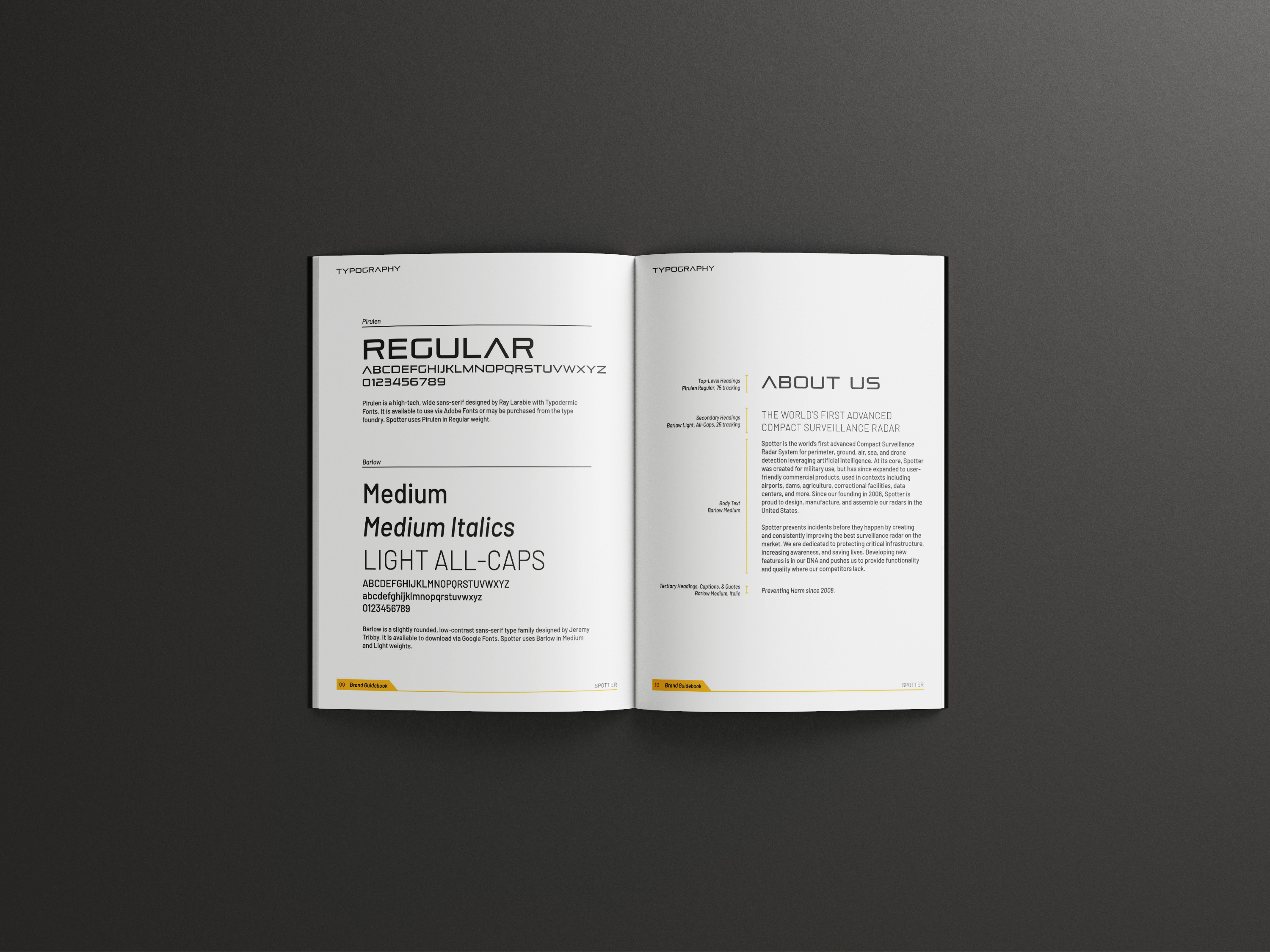
Accurately understanding and applying typography guidelines promotes brand consistency, and also helps convey our brand voice through using the exact designated fonts chosen to represent us. The ability to utilize the defined hierarchy rules allows our message to be clearly read and understood. When designed well, we use type hierarchy to guide the eye through a sequence of written content – a heading will be read first, a subheading will be read second, and a body paragraph will be read last.
Rarely should typography guidelines ever be broken. The designated type system should allow for enough flexibility and versatility to use in any context. However, there may be instances that warrant using special typography such as social posts for holidays or internal communications. It is best to always try to use at least one brand typeface in these instances to maintain some consistency.
Understanding typography is a large topic in itself, and GTMA has an excellent blog specifically about brand typography that goes into the terminology and identification of fonts when it comes to branding.
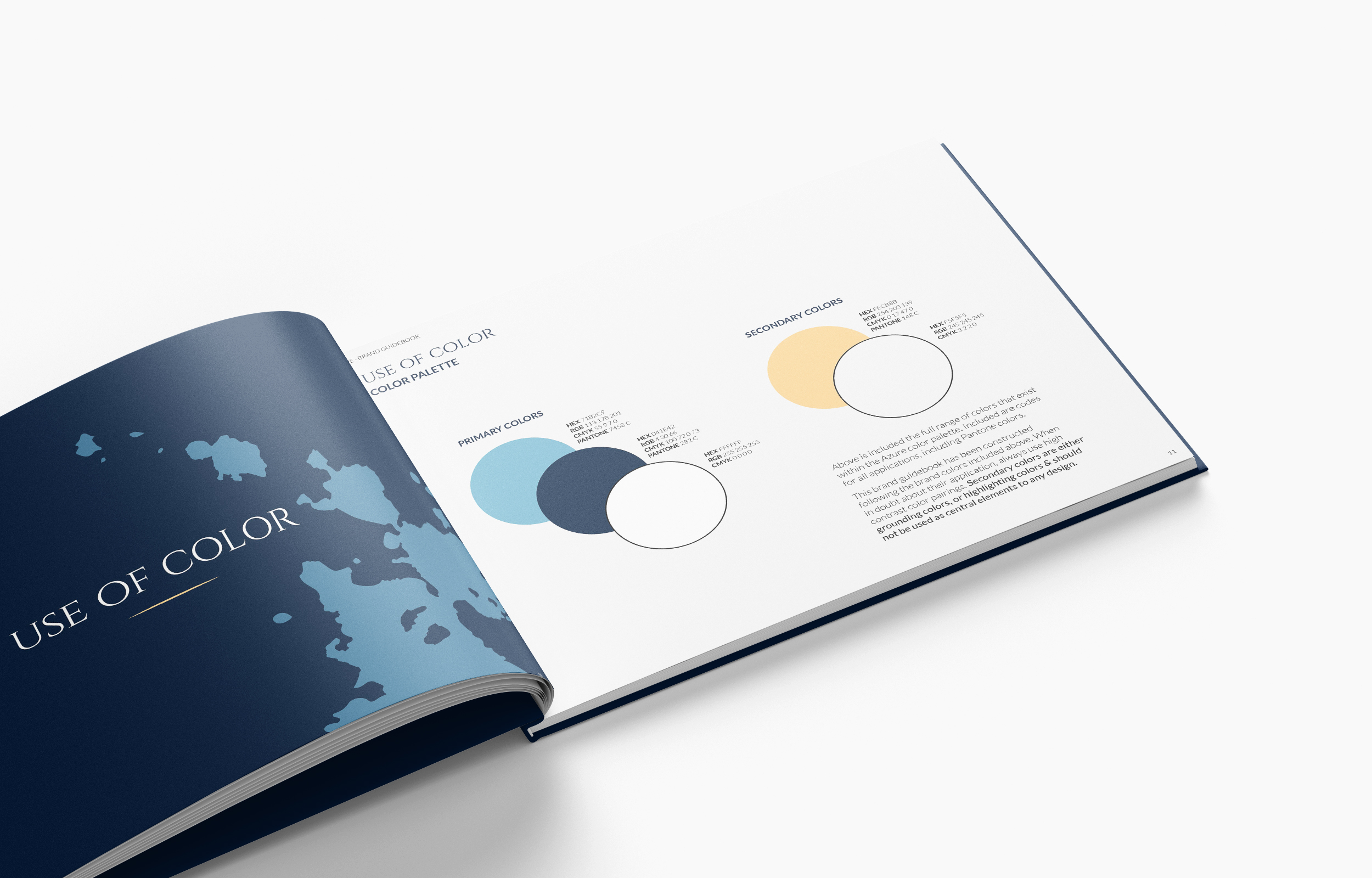
Color Palette
Your brand color palette is a set of designated colors that are chosen to represent the brand identity. Color evokes emotional response and resonates with an audience faster than anything, so it’s another element that must be treated with care through guidelines. Similar to typography, the section on color should include a few things – what are the brand colors, how are they used, and sometimes why or how they encapsulate the brand.
There will be a visual that outlines what the colors are. This should include a name for each color, and the color values such as HEX code, RGB values, CMYK values, and sometimes the closest equivalent Pantone code. Just understanding these values is crucial for brand guideline adherence:
- HEX: a 6-digit combination of letters and numbers used in digital contexts. Most commonly used in web development, but also used in design applications.
- RGB: a group of 3 number values equivalent to the red, green, and blue values of a color. Used in digital contexts.
- CMYK: a group of 4 number values equivalent to the cyan, magenta, yellow, and black values of a color. Used for print contexts.
- PMS (Pantone Matching System): patented, standardized color values made by the Pantone company. Used primarily in print contexts.
For the most part, only graphic designers and printers will need to understand the nuance behind each of these color values to know which values to use in which context. The HEX code is the most all-encompassing and universal in this digital age.
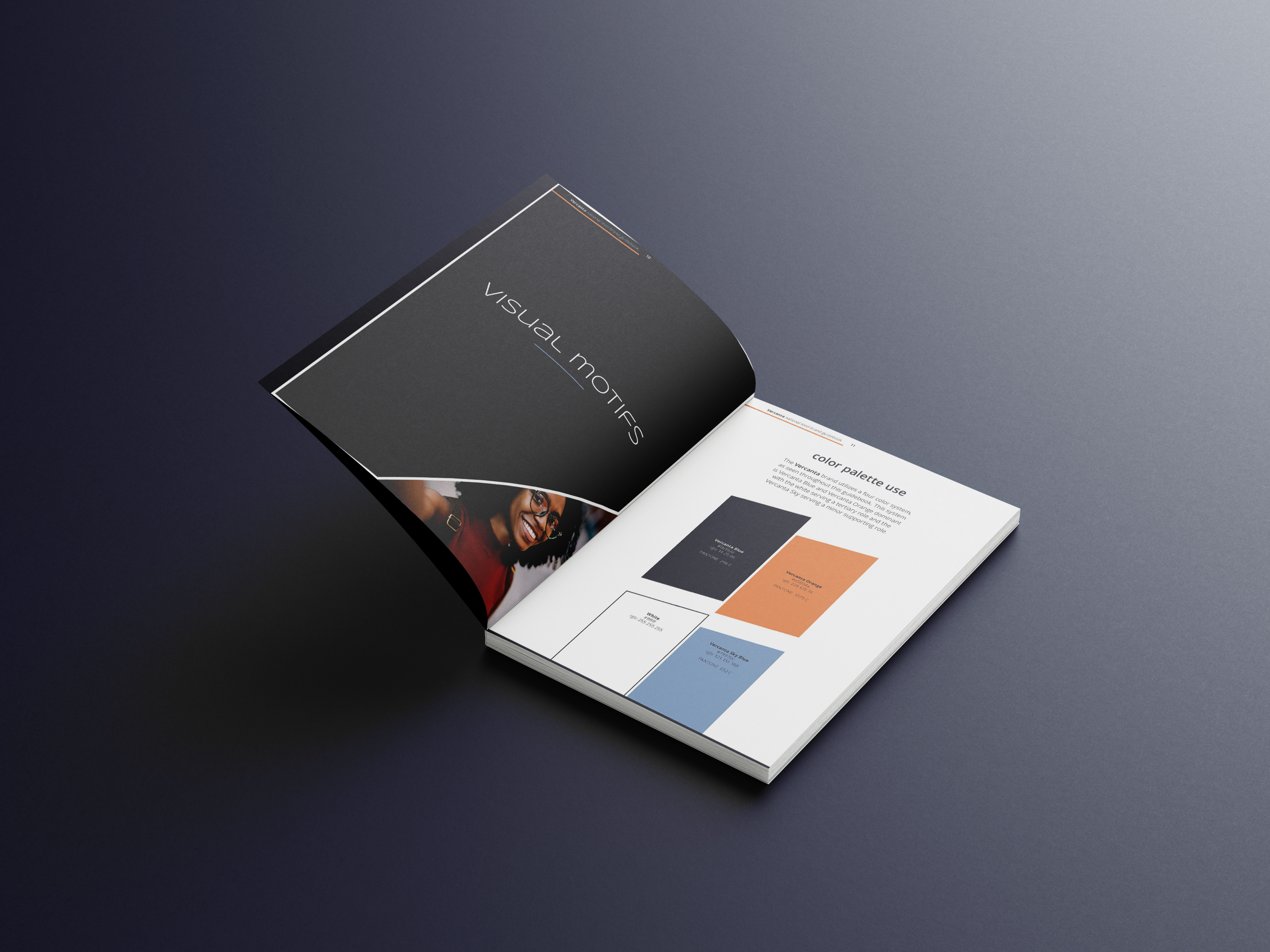
The brand guide section on color may also include a breakdown of how the colors are prioritized. There may be a set of primary colors which are the most prevalent and commonly used colors that best represent the brand, and a set of secondary colors that support the primary colors. Occasionally there may also be tertiary colors, the ones that are used the most rarely but may pop up as accents. Most brands include a shade of white or off-white, and sometimes a shade of black for versatility. The prioritization of color may be broken down using percentages or some kind of visual reference showing the hierarchy and color relationships.
Also like typography, there are some special instances where it may be appropriate to deviate from the brand color palette, like special events, holidays, special campaigns, etc. However, it is a good practice to continue to incorporate your brand colors as much as possible.
Using the color guidelines with precision is critical, as color directly influences consumer behavior and is crucial to building brand recognition and consistency. Skilled use of color is the exact reason we recognize Coca-Cola by their use of red – they have defined rules around the exact shade of red to use where, and have built a brand around repeated use.
Color is another topic that is very nuanced and extensive, and it’s another topic we’ve written a blog specifically about. Take a look at Understanding Color Marketing & What It Means For Your Brand.
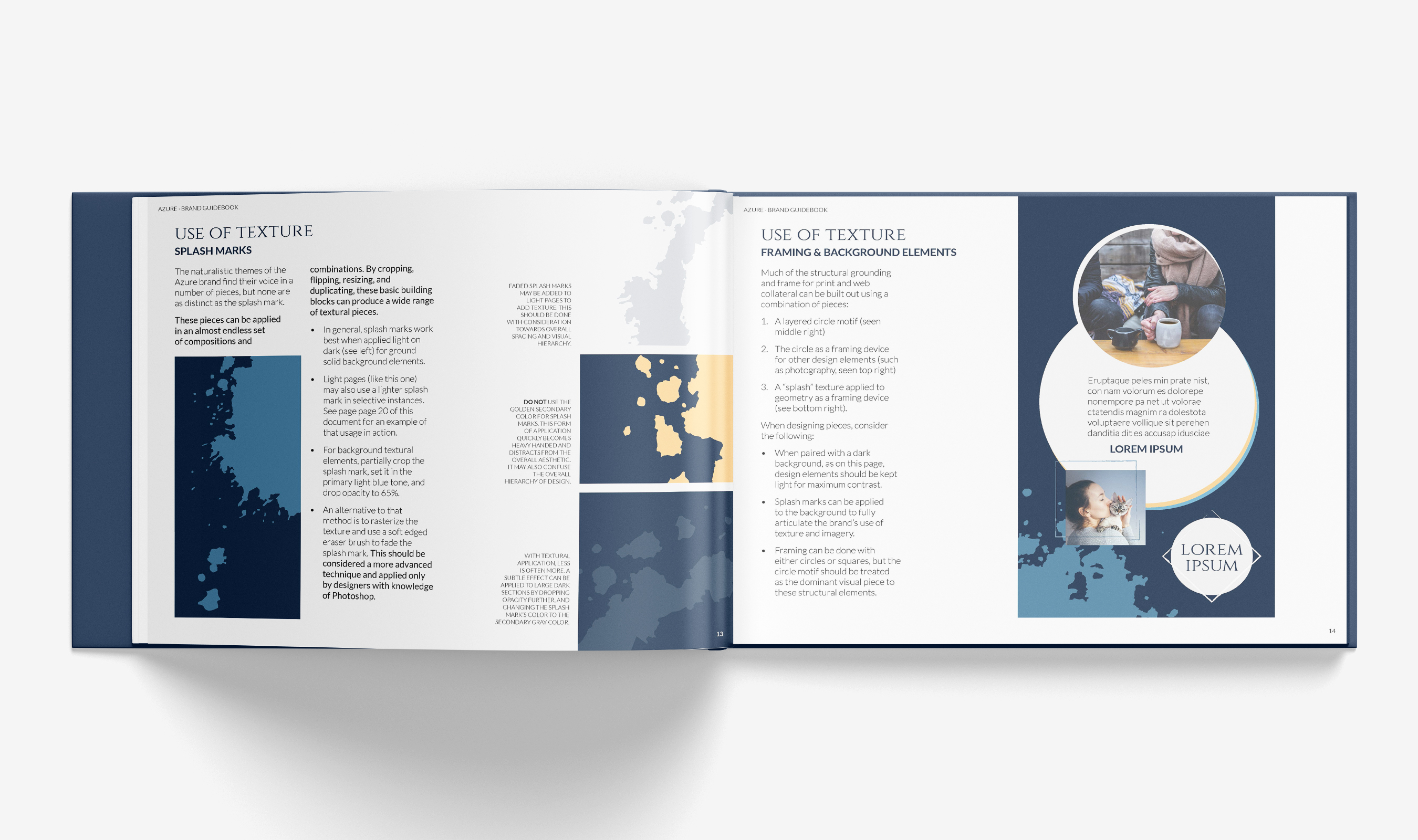
Other Visual Motifs
Supporting visual elements can vary greatly for each brand, but they can include anything from illustration styles, icon styles, patterns or textures, or other graphics used to reinforce visual communications. This section of the Brand Guidelines should outline each of these elements and provide guidance on how to use them. These motifs are generally not meant to overpower the brand identity. They should be used only when appropriate and relevant to the piece of communication. They are chosen and created to compliment the established voice and tone of the brand.
Brand icons are succinct illustrations created to represent anything from product or service offerings, brand values, or other information about the brand. The Brand Guide should show a library of available icons, though the Guide also serves as a reference for when new icons are created so they can match the styling of existing icons. Typically icons are used in conjunction with written content.
A brand may have illustrations beyond iconography. Like icons, the Brand Guide should include a selection of what those illustrations look like so that using and creating branded illustrations can be done with uniformity.
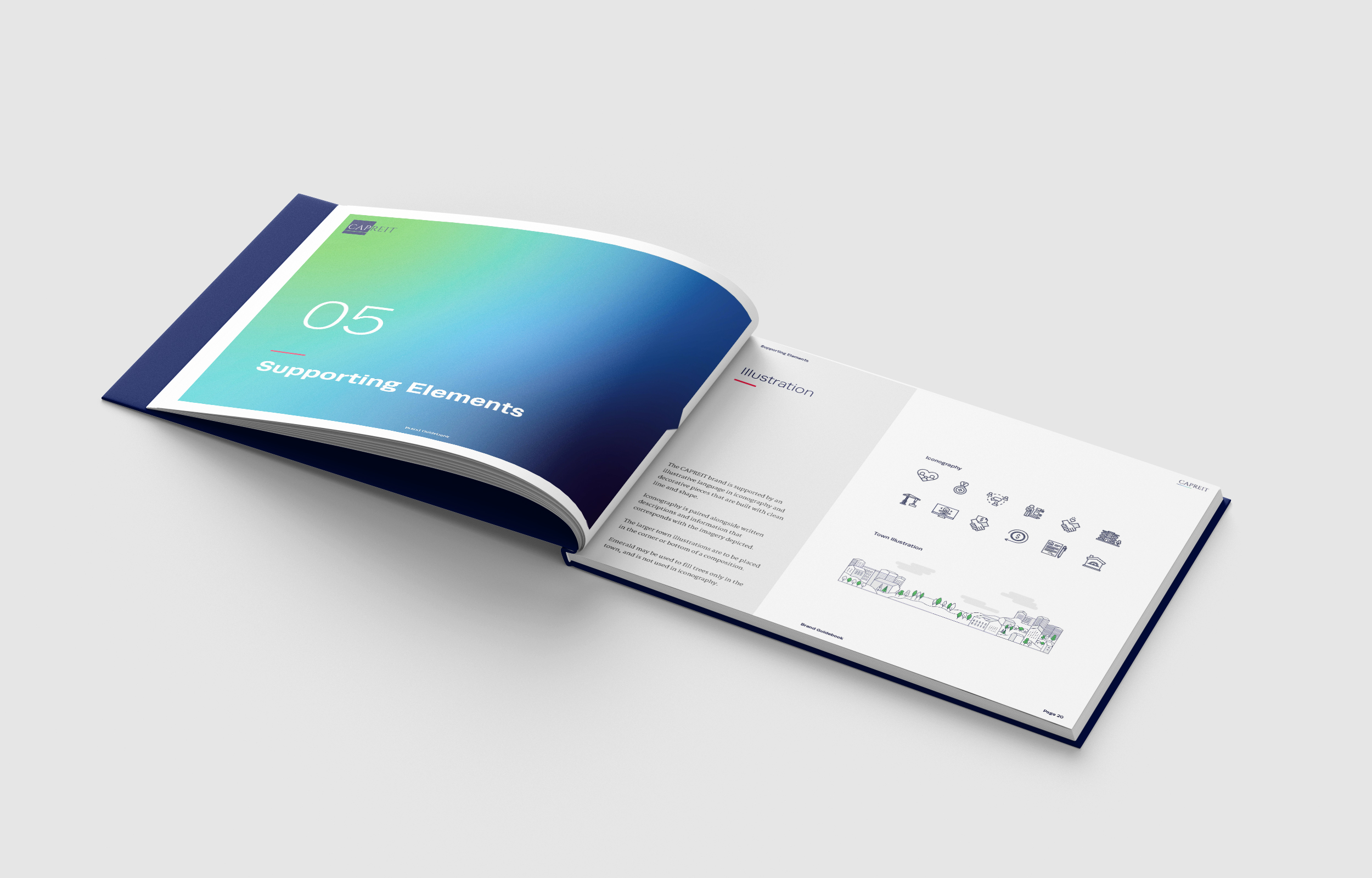
Branded patterns and textures are included to use as background or overlay pieces to add dimension to marketing design. It’s important that pattern and texture rules are followed so that communications are legible and readable.
Other visual components a Brand Guide could outline might include borders or frames, lines or shapes used in conjunction with text or design, and other graphic pieces that further supplement and build upon the brand identity. While each of these items will have its own distinct rules for use, it’s crucial these rules are followed to maintain quality in design compositions and to help establish a strong, resounding brand identity that an audience connects with.
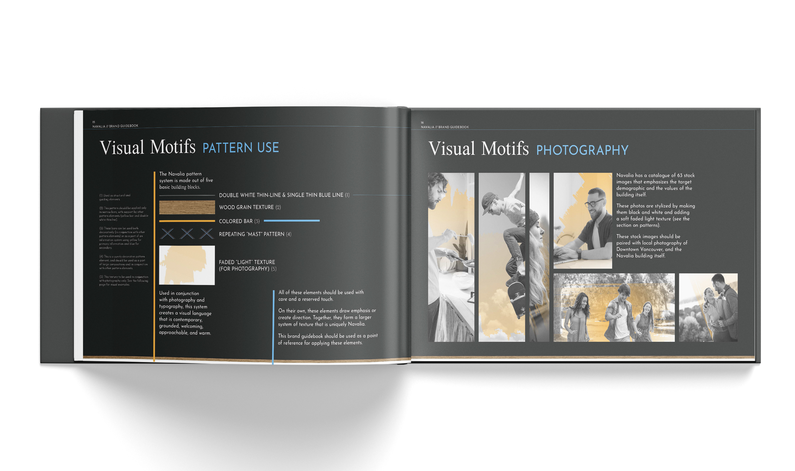
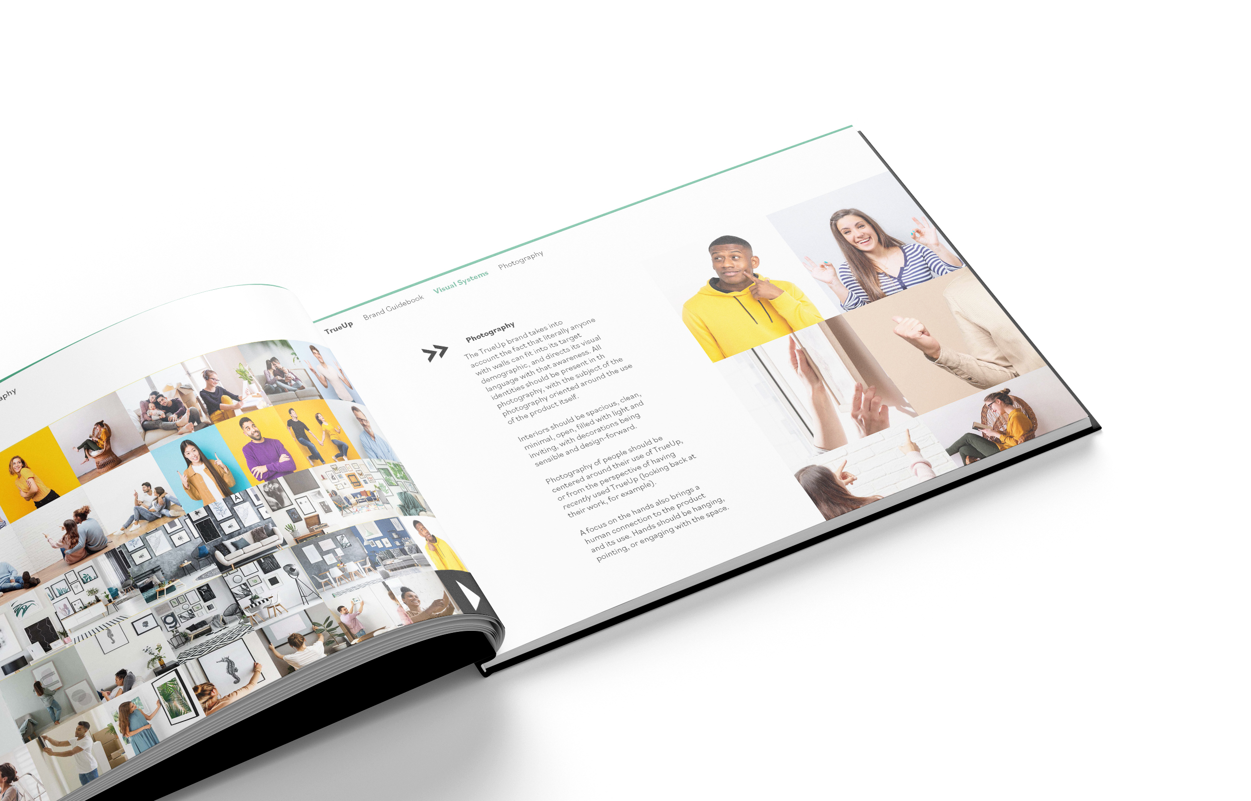
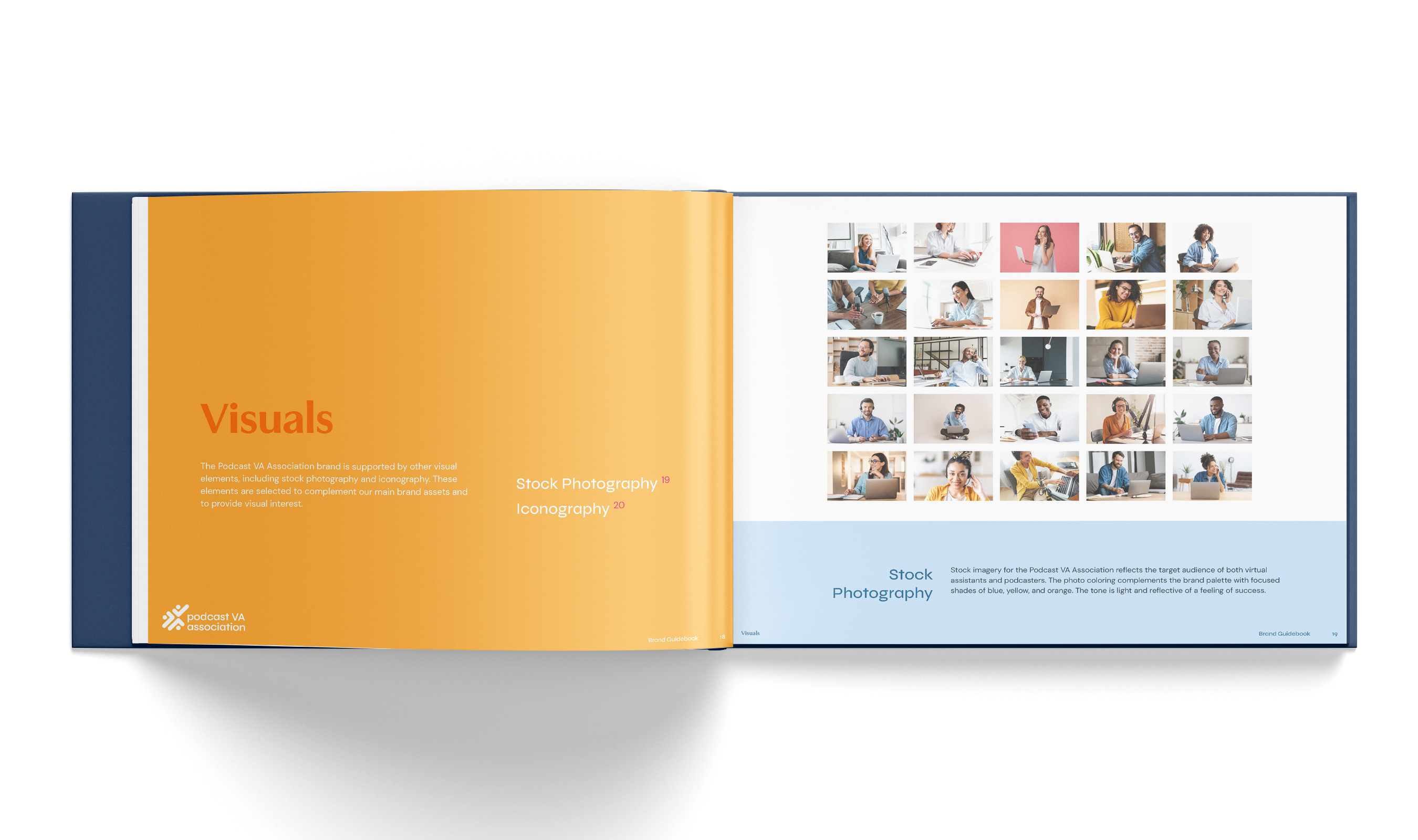
Photography Styles
Brands that use photography throughout marketing communications, especially those selling products, may prefer to have a specific way of styling photos so all imagery remains consistent, on-brand, and recognizable. It could be coloring, application of filters or effects, backgrounds, certain angles or cropping, or how to set up shots. This section of the Brand Guide will provide guidance and examples so that the same set of guidelines is followed when taking new photos.
Some brands may also use a selection of stock photography to support their marketing efforts, typically brands that don’t shoot their own photography. The Brand Guide may include a look at the stock collection, and provide insight into the preferred look and feel of stock photos to preserve a consistent tone.
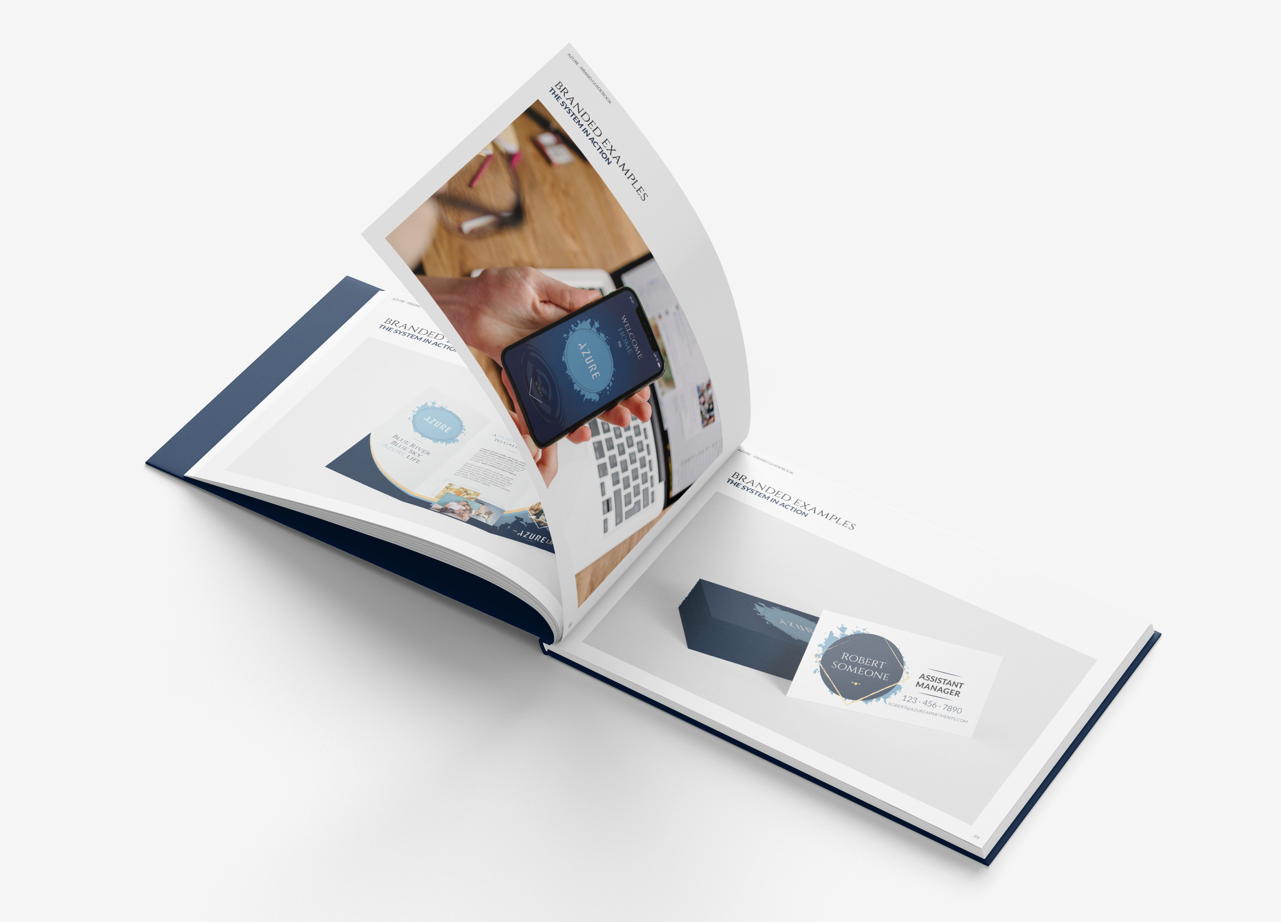
Examples of the Brand in Use
A Brand Guide document is usually closed out by including a section of branded examples that tie together everything reviewed in the Guide. These are especially useful for those who are visual learners and prefer to see examples of the elements applied versus reading or viewing diagrams outlining the rules. These examples are also helpful in guiding the design of new marketing materials as designers can pull inspiration and layout ideas from these.
Ideally, this section will incorporate examples of the brand identity in both print and digital contexts, and in large-scale and small-scale contexts. The brand might adapt differently on a website or social media post versus on a print advertisement or letterhead, just as signage or a large-scale banner might be styled differently from a branded sticker or business card. It’s key to be able to see exactly how the brand adapts to various contexts so knowing how to market the brand through different mediums is a breeze.
When and How Do I Create a Brand Guide?
The great news is, you do not need to be a new brand or go through a rebrand in order to create a Brand Guidelines document — you can create a Brand Guide any time you want to! The inception of a brand and rebranding are great times to create a Brand Guide since you are developing the elements and rules simultaneously, but your business can be in any phase of growth to warrant needing a Brand Guide. If your business is rapidly growing in such a way that requires more care and attention given to the brand identity, like creating new products, hiring new team members, and increasing marketing efforts, this is a great checkpoint that may call for the creation of a Brand Guide. But it could be as simple as feeling ready to formally establish the brand identity for your team to use by putting all the mental checklists and ideas down onto a document format.
All you need to create a Brand Guide is your established brand components, to work through the rules surrounding their usage, and a way to build the document. You may give this task to an in-house designer or marketing specialist, or an outside designer or agency. Your Brand Guide may be as simple as a slide presentation or document or may be built in a design program such as Adobe InDesign. You will just want to make sure a PDF version exists for your team to access and share at any time. You may also decide to print your Brand Guidelines out if you prefer working with tangible documents. Nowadays many larger companies opt to create a webpage specifically to host their Brand Guidelines and asset download links. This is a more user-friendly option, and necessary when you have many hands touching the brand identity at all times.
How Can GTMA Help?
When you brand with GTMA, we always include a thorough Brand Guidebook that houses all of your brand elements and usage guidelines. Our Logo package also includes a Style Guide with logo usage rules, color palette, and typography. If you already have a brand identity and are just looking to have a Brand Guide made, we can help with that too! Shoot us a message today to learn more about Branding and Design with GTMA.
We’ve just made branding a heck of a lot easier for our multifamily clients with an all-new product offering — Ready-Made Brand Kits. This service takes the extra time, effort, and cost out of the branding process. Take your pick from a robust library of brand concepts that we can tweak to perfection fitting your community’s vibe, and come all tied together in a Brand Guidebook along with branded assets to help establish your new brand identity. Visit this landing page to learn whether a Ready-Made Brand Kit is the right fit for your communities.